Quick UI customization
Suppose you need to perform high-level customization of the interface elements such as logo, copyright labels, some colors of the toolbar & sidebar. In that case, it might be sufficient to do it through Access Manager and Configuration Manager.
Before you customize
Before customizing interface elements, review the following topics to learn where the logos and other elements are reused in different places. Check all the pages to ensure you have the desired result.
For best results, we recommend using a single image or text in HTML display name for the logo in all places (Login page, Home page, toolbars, About dialog.) Ensure that the logo looks good on the toolbar’s background and on the white background of the Login, Home, and About pages. If you need a different logo for the main toolbar, upload a logo image and adjust its position.
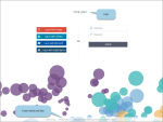
The following image shows the default Look & Feel settings.
Customizable elements
On the Login page, you can change the logo (per tenant) and the footer information (per installation).
You can change the logo on the Login page through Access Manager.
Depending on the defined fields, the logo can be taken from different places according to the following priority order:
HTML display name
This field allows you to use the HTML tags and define the style of the text or an image.
For example,
<p style=”color:#444d58; font-size:18px; font-family:roboto;”>YOUR LOGO</p>.By default, you will see the link to the image with the DataClarity logo saved in skins, for example:
<img src="https://qa.dataclarityonline.com/dataprep/skins/v2/standard/imgs/company_logo.svg" style="width:170px;" />Note: This field is used for the Home page. It may be used for a logo on the main toolbars and the About dialog.
Display name (is used when the HTML display name is empty)
This field can be used to provide a tenant’s name. The text added in this field will be converted to uppercase and shown instead of a logo.
If you don’t specify any display name or HTML display name, the Login page will use the default label “DATACLARITY”.
The labels and links are defined in the Branding configuration settings (Configuration Manager). For details, see References.
You can change the logo for the Home page through Access Manager.
Depending on the defined fields, the logo can be taken from different places according to the following priority order:
HTML display name
This field allows you to use the HTML tags and define the style of text or an image.
For example,
<p style=”color:#444d58; font-size:18px; font-family:roboto;”>YOUR LOGO</p>.By default, you will see the link to the image with the DataClarity logo saved in skins, for example:
<img src="https://example.com/dataprep/skins/v2/standard/imgs/company_logo.svg" style="width:170px;" />Note: This field is used for the Login page. It may be used for a logo on the main toolbars and the About dialog.
Display name (is used when the HTML display name is empty)
This field can be used to provide a tenant’s name. The text added in this field will be converted to uppercase and shown instead of a logo.
If you don’t specify any display name or HTML display name, the logo container is empty.
In the Storyboards and Data Preparation interface, you can change the logo and define the look & feel of the toolbar and sidebar.
You can change the logo for the main toolbar through Access Manager.
The logo can be taken from the various places in the following priority order:
Logo
In the Logo field, you can upload an image to use on the toolbar in Data Preparation and Storyboards (including the About dialog).
You can adjust the logo height, top padding, and left padding.
HTML display name (if you remove the logo from the Logo field)
This field allows you to use the HTML tags and define the style of text or an image).
We recommend adding your logo in this field if you want to single-source it and it looks well everywhere, on the toolbar, on the Login page, the Home page, and in the About dialogs. For example,
<p style=”color:#444d58; font-size:18px; font-family:roboto;”>YOUR LOGO</p>.By default, you will see the link to the image with the DataClarity logo saved in skins, for example:
<img src="https://example.com/dataprep/skins/v2/standard/imgs/company_logo.svg" style="width:170px;" />Note: This field is used for the Home page (for a logo on the main toolbars and the About dialog).
Even if you remove the logo image and leave the HTML display name empty, the default logo is shown anyway.
You can change the colors for backgrounds, text & icon, and hover. For details, see References.
The About dialogs are available in Data Preparation and Storyboards when you click Help > About. In the About dialog, you can change the logo and the footer information.
You can change the logo for the About dialog through Access Manager.
Depending on which fields are defined in Access Manager, the priority order for the logo is the following:
Logo (image upload)
In the Logo field, you can upload an image that is used on the toolbars and in the About dialog.
HTML display name
If you remove the default logo, the logo from the HTML display name field is used.
By default, you will see the link to the image with the DataClarity logo saved in skins, for example:
<img src="https://example.com/dataprep/skins/v2/standard/imgs/company_logo.svg" style="width:170px;" />When both fields mentioned earlier are empty, the default two-color logo is used.
The labels and links are defined in the Branding configuration settings (Configuration Manager). For details, see References.
The Avatar menu is available on all pages where see the user’s avatar (main toolbars in Storyboards and Data Preparation, Home page, Account Management page, Access Manager.)
The link to the Customer Care Portal can be customized in Configuration Manager through the Customer Support URL field. For details, see References.
References
The following are the excerpts from the Access Manager and Configuration Manager Help. For details, refer to the corresponding Help files available on the Documentation Help Home page.
In Access Manager, on the left sidebar, click Settings, and then click the Look & Feel tab.
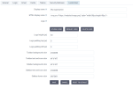
On the Look & Feel tab, you can customize the appearance of some user interface elements in the platform. After the edits on this tab, click Save to apply the changes. You can also revert the changes to the default settings.
| Item | Description |
|---|---|
Display name | Specify the realm display name. The display name (in uppercase) is used as a logo label if the HTML display name is empty, on the Login and Home pages of the platform. |
HTML display name | Specify the logo label or image with the HTML formatting. You can provide the link to the image and define the sizing. For example, <img src="https://www.yourwebsite.com/logo.png" style="width:90px;height:42px;">. The HTML display name is applied on the following pages of the platform:
|
Logo | Upload your logo or use a default one. You can control its size and padding by using the logo height and padding settings. If you delete the logo from this field, the HTML display name will be used. |
Logo height (px) | Specify the logo image height, up to 40 px. |
Logo padding top (px) | Specify the padding above the logo image. Move the logo within the toolbar area (the toolbar height is 42 px). |
Logo padding left (px) | Specify the padding to the left of the logo image. |
Toolbar background color | Specify the color for the top toolbar. |
Toolbar text and icon color | Specify the color for the text and icons on the top toolbar |
Sidebar background color | Specify the color for the left sidebar. |
Sidebar text and icon color | Specify the color for the text and icons on the left sidebar. |
In Configuration Manager, on the sidebar, go to Configuration > Branding.
You can configure the following settings for the platform branding.
| Item | Use this item to |
|---|---|
Terms of use URL | Specify the URL to the Terms of Use link used on the login page and in the About dialogs. |
Privacy Policy URL | Specify the URL to the Privacy Policy link used on the login page and in the About dialogs. |
Copyright text label | Specify the copyright label used on the login page and in the About dialogs. |
Customer Support URL | Specify the URL to the Customer Support link in the avatar menu. |


Comments
0 comments