Color palettes
Before choosing a specific color palette for a widget, choose a palette category that best suits your data. Color palettes are categorized as diverging, qualitative, and sequential.
Diverging palettes
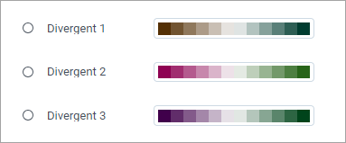
Use diverging palettes to emphasize quantitative data that deviate from the middle range (norm). The extremes are marked by two contrasting hues, and the middle ranges are marked by a lighter mix of the two hues.

You can use palette Divergent 1 to show the decrease and increase of unemployment in different countries:
- The countries where unemployment increased the most are marked as dark brown.
- The countries where unemployment increased the least are marked as dark green.
- The countries where the situation only slightly changed are marked with light colors.
Qualitative palettes
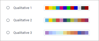
Use qualitative palettes to compare qualitative categories by using different hues.

You can use palette Qualitative 1 in a clustered bar visualization that shows planned and actual sales for the different departments of a store. In this case, each department is represented with a contrasting color for easy identification. The actual sale values are represented by the length of the bars, not by colors.
Sequential palettes
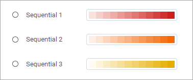
Use sequential palettes to organize quantitative data from low to high by using a gradient effect to show progression.

You can use palette Sequential 1 to show the unemployment rate on the map. In this case, the country with the highest rate is presented with the darkest red color. The rates are compared based on the gradient.
Comments
0 comments