Visualization settings (appearance tab)
Use the  appearance tab in the widget settings pane to define the settings related to the appearance of the visualization, such as its color palette, background, fonts, margins, and number format.
The settings available depend on the visualization type. The following sections can be available.
General
The following sections are available in various widgets.
Use this section to define the color palette of the visualization, style, and display options.
| Item | Use this item to | ||||||||||||||||||||||||||||||||||||||||||||||||||||||
|---|---|---|---|---|---|---|---|---|---|---|---|---|---|---|---|---|---|---|---|---|---|---|---|---|---|---|---|---|---|---|---|---|---|---|---|---|---|---|---|---|---|---|---|---|---|---|---|---|---|---|---|---|---|---|---|
Palette | Select the color palette for the visualization. For the visualizations from the Geospatial category, select the color palette used to mark values represented by a measure in the Color field. | ||||||||||||||||||||||||||||||||||||||||||||||||||||||
Opacity | Define the opacity (transparency) level for the selected palette. | ||||||||||||||||||||||||||||||||||||||||||||||||||||||
Reverse palette | Show the colors in the palette in reverse order. | ||||||||||||||||||||||||||||||||||||||||||||||||||||||
Enable hover effect | Show a specific color for the pointer, image, or area on the map when pointing to it. | ||||||||||||||||||||||||||||||||||||||||||||||||||||||
Hover | Select a color for hover effect when pointing to the map pointer, image, or region. | ||||||||||||||||||||||||||||||||||||||||||||||||||||||
Style | Select the style of the elements in the visualization, such as bars and columns (3D, cylinder, or flat). | ||||||||||||||||||||||||||||||||||||||||||||||||||||||
Theme | For the Table visualization, select a style for the table: light or dark. Then, you can modify the table appearance as needed. However, if you change the style afterward, all your customizations will be also reset. | ||||||||||||||||||||||||||||||||||||||||||||||||||||||
Display | Select the display option for the visualizations from the Line and Markers category (line, line and markers, or markers). | ||||||||||||||||||||||||||||||||||||||||||||||||||||||
Rotate | Turn the stock chart horizontally. | ||||||||||||||||||||||||||||||||||||||||||||||||||||||
Hand drawn | Apply the hand-drawn effect to the visualization. | ||||||||||||||||||||||||||||||||||||||||||||||||||||||
Hand draw scatter | Make the hand-drawn effect less or more visible. Increase the number for a more visible effect. | ||||||||||||||||||||||||||||||||||||||||||||||||||||||
Hand draw thickness | Define the hand-drawn effect by specifying the thickness of lines in a visualization: category axis, value axis, tooltip line, and value lines. | ||||||||||||||||||||||||||||||||||||||||||||||||||||||
Color range | Select one of the following options for calculating the color range:
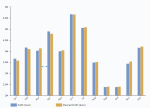
A dataset contains the following values for gross sales.
The following heatmap palette is used.
If the color range is calculated by ranking the values, the (gross sales) values are represented as follows (the huge difference between the maximum value and the other values is not visible on the map; the values are distributed evenly).
If the color range is calculated based on the values themselves, the (gross sales) values are represented as follows (the huge difference between the maximum value and the other values is visible on the map).
This option is available for the visualizations from the Geospatial category. | ||||||||||||||||||||||||||||||||||||||||||||||||||||||
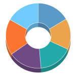
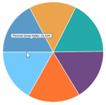
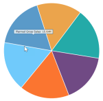
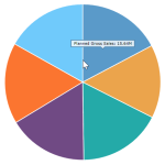
Angle | Define the lean angle for the visualizations from the Pie & donut category, in degrees. The value range is from 0 through 90. This setting is designed for the 3D style. | ||||||||||||||||||||||||||||||||||||||||||||||||||||||
Start angle | Define the angle of the first slice, in degrees, for the visualizations from the Pie & donut category. The value range is from 0 through 360. This setting is designed for the Flat style. If you use it for the 3D style, the only values applicable are 90 or 270. |
Use this section to define the visualization background.
| Item | Use this item to |
|---|---|
Background color | Define the color (including transparency) for the widget background. |
Image | Enter a URL or click the icon on the right to download an image for the visualization background. Ensure that the background color is transparent so that the image is visible. |
Image size type | Select how to define the image size: in percentage or in pixels. |
Image width | Define the width of the background image (in percentage or pixels, depending on the selected size type). |
Image height | Define the height of the background image (in percentage or pixels, depending on the selected size type). |
Image position | Define the alignment of the background image (bottom center, bottom left, bottom right, left, right, center, top center, top left, or top right) within the visualization area. |
Border color | Define the border color of the visualization. In most charts, the border does not include the area with the legend. |
Default regions color | Define the color of the map unfilled regions. In the Pointer map visualization, the color applies to the whole map area. |
Region border color | Define the color and transparency of the borders for regions on the map visualizations. |
Plot background color | Define the background color of the plot area of the visualization. |
Plot border color | Define the border color of the plot area of the visualization. |
Use this section to define the title style of the visualization.
| Item | Use this item to |
|---|---|
Show title | Specify whether to display the title of the visualization. The title is placed at the top of the visualization. |
Title | Enter a title for the visualization. |
Position | Specify the title position (top or bottom). This option is available for the Single Value visualization. |
Font family | Specify the font family used for the title. |
Bold | Apply bold formatting to the title text. |
Font color | Define the text color used in the title of the visualization. |
Font size | Define the text size used in the title of the visualization. |
Show title | Include the title in the visualization. This option is available for the Single Value visualization. |
Use this section to define the legend settings of the visualization.
| Item | Use this item to |
|---|---|
Show legend | Specify whether to display the legend of a chart. The legend represents a concise explanation of the items used in a chart. The legend can be excluded from view if the Enable responsive setting is turned on and the widget size is too small to show the legend. |
Show range colors | Specify whether to display the legend for the colors representing ranges in the Bullet and Meter gauge visualizations. |
Position | Define the alignment of the legend (bottom center, bottom left, bottom right, left, right, top center, top left, or top right) within the visualization. |
Background color | Define the background color of the legend. |
Border color | Define the border color of the legend. |
Bold | Apply bold formatting to the legend label. |
Font family | Specify the font family for the text in the legend. |
Font color | Define the text color used in the legend. |
Font size | Define the text size used in the legend. |
Use this section to define the styles for data labels.
| Item | Use this item to |
|---|---|
Show data labels | Specify whether to display value labels for each data point in the visualization. |
Show location labels | Specify whether to display category labels for each location point in a map. |
Bold | Apply bold formatting to the data labels. |
Font family | Specify the font family used for the data labels. |
Font color | Define the text color used in the data labels. |
Font size | Define the text size used in the data labels. |
Use this section to make the value axis visible in the plot area.
| Item | Use this item to |
|---|---|
Show value axis | Specify whether to display the value axis. |
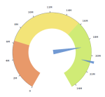
Axis radius | Specify where to place the value axis, as a distance from the center (radius), in the Meter gauge visualization. In the following example, the value axis radius is the same as the Range end radius. |
Logarithmic scale | Use the logarithmic scale for the value axis of a chart. On a logarithmic scale, each point is the previous point multiplied by some number. This way, a wide range of values is reduced to a more manageable range. |
Axis grid fill color | Define the color to fill every second space between the grid lines of the value axis grid. If you do not need to show this color, leave it transparent. |
Label rotation | Specify the angle degree to rotate the labels:
This setting appears only when the axis is horizontal in the visualization. |
Bold | Apply bold formatting to the label of the value axis. |
Font family | Specify the font family used for the text to denote values (measures). |
Font color | Define the color of the text used to denote values (measures). |
| Font size | Define the size of the text used to denote values (measures). |
Axis start | Override the automatically defined minimum value where to start the value axis. Depending on the widget size, the actual axis minimum can be automatically rounded in some cases. Note that the visualization is cut if the data values are lower than the axis minimum. To use the automatic axis minimum value, clear this field. |
Axis end | Override the automatically defined maximum value for the value axis. Depending on the widget size, the actual axis maximum can be automatically rounded in some cases. Note that the visualization is cut if the data values are higher than the axis maximum. To use the automatic axis maximum value, clear this field. |
Axis color | Define the color of the axis used to denote values (measures). |
| Axis thickness | Define the thickness of the axis used to denote values (measures). |
Axis tick length | Define the length of the ticks on the axis used to denote values (measures). |
Grid dash length | Define the length of the dashes if the grid lines are dashed. By default, the grid lines are not dashed (the value is set to 0). |
Grid color | Define the color of the grid lines. |
Grid thickness | Define the thickness of the grid lines, including axis ticks. |
Use this section to make the category axis visible in the plot area.
| Item | Use this item to |
|---|---|
Show category axis | Specify whether to display the category axis. |
Axis grid fill color | Define the color to fill every second space between the grid lines of the category axis grid. If you do not need to show this color, leave it transparent. |
Label rotation | Specify the angle degree to rotate the labels: 0° (horizontal position), 45° and -45° (rotated to the right or left), 90° and -90° (vertical position). This setting appears only when the axis is horizontal in the visualization. |
Alternate label position | Specify whether to change the position of every other label (up and down). This is useful when labels are placed horizontally to avoid overlapping. This setting appears only if the category axis is horizontal in the visualization. |
Label spacing | Set the space between the labels on the category axis. A smaller label spacing allows for more category labels visible on the axis. |
Bold | Apply bold formatting to the label of the category axis, excluding the labels of the dimension that is used for grouping. |
Font family | Specify the font family used for the text to denote categories (dimensions). |
Font color | Define the color of the text used to denote categories (dimensions). |
Font size | Define the size of the text used to denote categories (dimensions). |
Axis color | Define the color of the axis used to denote categories (dimensions). |
Axis thickness | Define the thickness of the axis used to denote categories (dimensions). |
Axis tick length | Define the length of the ticks on the axis used to denote categories (dimensions). |
Grid dash length | Define the length of the dashes if the grid lines are dashed. By default, the grid lines are not dashed (the value is set to 0). |
Grid color | Define the color of the grid lines. |
Grid thickness | Define the thickness of the grid lines. |
Grid position | Define the position of the category axis grids. If you select Middle, the grid connects the two closest categories. If you select Start, a category is placed in the middle of the grid. |
Use this section to define the styles for the chart cursor and the tooltips that appear over the axes area. A chart cursor is a line that you see when hovering over the plot area. It helps identify the precise position on the value axis. It can be used to zoom a certain area on the chart plot.
| Item | Use this item to |
|---|---|
Show value axis tooltip | Specify whether to display a tooltip over the value axis area when hovering over the plot area of the visualization. |
Show category axis tooltip | Specify whether to display a tooltip over the category axis when hovering over the plot area of the visualization. |
Category line shadow | Specify whether to display the category line shadow. |
Tooltip background color | Define the background color for the tooltips on the axes. |
Tooltip font color | Define the text color used in the axes tooltips. |
Zooming | Specify whether to enable zooming by using a cursor. To zoom, click and drag across a region to make a custom selection of the area, then release the cursor. For details, see Interact with widgets. |
Bullet | Specify whether to show the bullet for the main tooltip when pointing to the data points. |
Bullet size | Define the size of the bullet to display for the main tooltip when pointing to the data points. |
Use this section to make the primary value axis visible in the plot area. This section appears for the charts with two value axes. The primary value axis shows the first measure in the Measures field.
For the scatterplot, bubble, and scatterplot heatmap charts, the section is called the x-axis.
| Item | Use this item to |
|---|---|
Show value axis | Specify whether to display the value axis. |
Show cursor tooltip | Specify whether to display the tooltip over the value axis area when pointing to the data points in the chart. |
Logarithmic scale | Use the logarithmic scale for the value axis of a chart. On a logarithmic scale, each point is the previous point multiplied by some number. This way, a wide range of values is reduced to a more manageable range. |
Axis grid fill color | Define the color to fill every second space between the grid lines of the value axis grid. If you do not need to show this color, leave it transparent. |
Label rotation | Specify the angle degree to rotate the labels:
This setting appears only when the axis is horizontal in the visualization. |
Bold | Apply bold formatting to the label of the value axis. |
Font family | Specify the font family used for the text to denote values (measures). |
Font color | Define the color of the text used to denote values (measures). |
Font size | Define the size of the text used to denote values (measures). |
Axis start | Override the automatically defined minimum value where to start the value axis. Depending on the widget size, the actual axis minimum can be automatically rounded in some cases. Note that the visualization is cut if the data values are lower than the axis minimum. To use the automatic axis minimum value, clear this field. |
Axis end | Override the automatically defined maximum value for the value axis. Depending on the widget size, the actual axis maximum can be automatically rounded in some cases. Note that the visualization is cut if the data values are higher than the axis maximum. To use the automatic axis maximum value, clear this field. |
Axis color | Define the color of the axis used to denote values (measures). |
Axis thickness | Define the thickness of the axis used to denote values (measures). |
Axis tick length | Define the length of the ticks on the axis used to denote values (measures). |
Grid dash length | Define the length of the dashes if the grid lines are dashed. By default, the grid lines are not dashed (the value is set to 0). |
Grid color | Define the color of the grid lines. |
Grid thickness | Define the thickness of the grid lines, including axis ticks. |
Use this section to make the secondary value axis visible in the plot area. This section appears for the charts with two value axes. The secondary value axis shows the second measure in the Measures field.
For the scatterplot, bubble, and scatterplot heatmap charts, the section is called the y-axis.
| Item | Use this item to |
|---|---|
Show value axis | Specify whether to display the value axis. |
Show cursor tooltip | Specify whether to display the tooltip over the value axis area when pointing to the data points in the chart. |
Logarithmic scale | Use the logarithmic scale for the value axis of a chart. On a logarithmic scale, each point is the previous point multiplied by some number. This way, a wide range of values is reduced to a more manageable range. |
Axis grid fill color | Define the color to fill every second space between the grid lines of the value axis grid. If you do not need to show this color, leave it transparent. |
Label rotation | Specify the angle degree to rotate the labels:
This setting appears only when the axis is horizontal in the visualization. |
Bold | Apply bold formatting to the label of the value axis. |
Font family | Specify the font family used for the text to denote values (measures). |
Font color | Define the color of the text used to denote values (measures). |
Font size | Define the size of the text used to denote values (measures). |
Axis start | Override the automatically defined minimum value where to start the value axis. Depending on the widget size, the actual axis minimum can be automatically rounded in some cases. Note that the visualization is cut if the data values are lower than the axis minimum. To use the automatic axis minimum value, clear this field. |
Axis end | Override the automatically defined maximum value for the value axis. Depending on the widget size, the actual axis maximum can be automatically rounded in some cases. Note that the visualization is cut if the data values are higher than the axis maximum. To use the automatic axis maximum value, clear this field. |
Axis color | Define the color of the axis used to denote values (measures). |
Axis thickness | Define the thickness of the axis used to denote values (measures). |
Axis tick length | Define the length of the ticks on the axis used to denote values (measures). |
Grid dash length | Define the length of the dashes if the grid lines are dashed. By default, the grid lines are not dashed (the value is set to 0). |
Grid color | Define the color of the grid lines. |
Grid thickness | Define the thickness of the grid lines, including axis ticks. |
Use this section to define the default number format (precision and prefixes).
| Item | Use this item to |
|---|---|
Override dataset formats | Select whether to apply the default number format to all numeric columns, overriding any formats defined in Data Preparation. If Off, the default number format applies only to the columns that do not have a format defined in Data Preparation. |
Precision | Specify the number of digits to be shown after the decimal point. |
Decimal separator | Enter the symbol used to mark the border between the integral and the fractional parts of a decimal numeral. |
Thousands separator | Enter the symbol used to group thousands in a numeral. |
Prefixes | Define the prefixes for big and small numbers by using the JSON syntax. Big numbers:
Small numbers:
|
Use this section to decide whether to use a default date format.
| Item | Use this item to |
|---|---|
Override dataset formats | Select whether to apply the default date format to all date columns, overriding any formats defined in Data Preparation. If Off, the default date format applies only to the columns that do not have a format defined in Data Preparation. |
Use this section to define the trellis layout and scale.
| Item | Use this item to |
|---|---|
Trellis layout | Specify the trellis distribution (auto, vertical, or horizontal) within the visualization. If you select Auto, the layout is automatically changed based on the number of individual charts into which the visualization is split. |
Same scale for all instances | Apply the same axis scale across all the individual charts into which the visualization is split. |
Use this section to define the visualization margins.
| Item | Use this item to |
|---|---|
Auto margins | Automatically set the margins of the visualization. |
Auto margin offset | Add an offset (in pixels) to the automatically added margins. This option is available if Auto margins is turned on. |
Top | Set the top margin of the visualization. This option is available if Auto margins is turned off. |
Right | Set the right margin of the visualization. This option is available if Auto margins is turned off. |
Bottom | Set the bottom margin of the visualization. This option is available if Auto margins is turned off. |
Left | Set the left margin of the visualization. This option is available if Auto margins is turned off. |
Use this section to set the resizing options for a visualization.
| Item | Use this item to |
|---|---|
Enable responsive | Set the visualization to dynamically scale its width and height to the size of the screen. The title, legend, and axes value labels may be hidden, depending on the size of the screen. |
Use this section to specify the initial visibility of the current widget.
| Item | Use this item to |
|---|---|
Initial visibility | If you create a show or hide action for this widget, you can specify whether the widget is initially visible or hidden when the page is opened or refreshed. For example, if you set the widget to Hidden, then in view mode, the widget is not visible, and you can use an action to show it on the storyboard canvas later. |
Table
The following sections are available only on the Table widget.
Use this section to define the settings of the headers for the Table.
| Item | Use this item to |
|---|---|
Hide column menu | Specify if you want to use the column options menu. To hide the |
Background color | Specify the background color used for the header. |
Font color | Specify the text color used for the header. |
Background hover | Specify which header background color to use when pointing to the header. |
Font hover | Specify which font color to use when pointing to the header. |
Font size | Specify the font size for the text in the header. |
Font family | Specify the font family for the text in the header. |
Font weight | Specify the font weight for the text used in the header: normal or bold. |
Font style | Specify the font style for the text used in the header: italic or normal. |
Height | Specify the height of the header row. |
Border color | Specify the border color for the header. |
Border position | Specify the header border position: bottom, top, top and bottom, or none. |
Border thickness | Specify the header border thickness. |
Use this section to define the settings of the row headers for the Table.
| Item | Use this item to |
|---|---|
Background color | Specify the background color used for the rows. |
Font color | Specify the text color used for the rows. |
Background hover color | Specify which background color to use when pointing to a row. |
Font hover color | Specify which font color to use when pointing to a row. |
Font size | Specify the font size for the text in a row. |
Font family | Specify the font family for the text in a row. |
Font weight | Specify the font weight for the text used in rows: normal or bold. |
Font style | Specify the font style for the text used in rows: italic or normal. |
Height | Specify the height of a row. |
Alternating rows | Specify whether to show alternating rows. |
Alternating color | Specify the color for alternating rows if you set the Alternating rows to On. |
Border color | Specify the color for a row border. |
Border position | Specify where you want to add a border for a row: bottom, top, or none. |
Border thickness | Specify the thickness of the row border. |
Use this section to define the settings of the row with total values at the end of the Table.
| Item | Use this item to |
|---|---|
Show totals | Define whether to show the row with total values for all measures displayed in the table. The totals row appears as a pinned row at the bottom of the table. If you load data incrementally (see Data loading), the row with totals appears on each page, showing the sum of the data that is already loaded. For example, the incremental load is 50 rows, you see the total for the first 50 rows, then for 100, and so on. |
Label | Specify the label for the totals row. |
Background color | Specify the background color used for the totals row. |
Font color | Specify the text color used for the totals row. |
Background hover color | Specify which background color to use when pointing to the totals row. |
Font hover color | Specify which font color to use when pointing to the totals row. |
Font size | Specify the font size for the text in the totals row. |
Font family | Specify the font family for the text in the totals row. |
Font weight | Specify the font weight for the text used in the totals row: normal or bold. |
| Font style | Specify the font style for the text used in the totals row: italic or normal. |
Border color | Specify the color for the totals row border. |
Border position | Specify where you want to add a border for the totals row: bottom, top, or none. |
Border thickness | Specify the thickness of the totals row border. |
Use this section to define the toolbar options in the Table.
| Item | Use this item to |
|---|---|
Grouping | Define whether to show the toolbar above the table that is used when you group data in rows:
For details, see Group rows. If you load data incrementally (see Data loading), grouping is not available. |
Use this section to define the pagination options in the Table.
| Item | Use this item to |
|---|---|
Show pagination | Define whether to show the pagination bar (at the bottom of the table) to allow navigation by pages instead of vertical scrolling. If you load data incrementally, the pagination bar shows the page total number after you load all the data. The number of rows per page equals Incremental load. For details, see Data loading. The following screenshot illustrates the pagination bar when the data is loaded partially (three pages as increments).
By navigating through all pages, one by one, you load all the data. As a result, the pagination bar now shows the total number of rows and pages.
|
Background | Define the background color for the pagination bar. |
Font color | Define the font color for the pagination bar. |
Font size | Define the font size used on the pagination bar. |
Use this section to define the sidebar options in the Table. If both options are turned off, the sidebar is not displayed.
| Item | Use this item to |
|---|---|
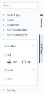
Filtering | Define whether to show the |
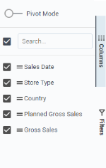
Pivoting | Define whether to show the If you load data incrementally (see Data loading), pivoting is not available. |
Geospatial
The following sections are available only in geospatial widgets.
Use this section to define the map properties for visualizations from the Geospatial category.
| Item | Use this item to |
|---|---|
Map | Select the map type. For example, world, specific country, continents, USA maps, United States (hex) map. You can use the Search field to quickly find the map you need. |
Resolution | Select the resolution for the map: high or low. |
Projection | Select the map projection:
|
Use this section to display map control elements in visualizations from the Geospatial category.
| Item | Use this item to |
|---|---|
Panning | Specify whether to allow panning a map. |
Zooming | Specify whether to allow zooming a map. If you choose not to display zoom controls, you can zoom the map by holding the Ctrl key and scrolling. |
Show Zoom Home button | Display the Zoom Home button that takes a user to the last zoom level saved by a visualization author. |
Show zoom controls | Display the buttons for zooming a map in and out. The buttons for zooming appear in the lower-right corner of the visualization. |
Use this section to define the appearance of lines that are connecting the points of a path in the Path map visualization from the Geospatial category.
| Item | Use this item to |
|---|---|
Line style | Define the style for the lines of a path: solid or dashed. |
Line type | Define the type of the lines of a path: arc, smooth, or straight. |
Scale line & arrow | To apply an automatic scale to the path lines and arrows. This way, the size of the lines and arrows does not change when you zoom a map. |
Line width | Adjust the width of the lines of a path by moving the slider. This option appears if you turn off the line & arrow scaling. |
Show direction | Display the arrows to show the direction in which the data points are connected in a path. |
Arrow width | Define the width of the direction arrow. |
Arrow height | Define the height of the direction arrow. |
Highlighter & Filter
The following sections are available only in the Highlighter and Filter widgets.
Use this section to define the font settings for the labels used in the Highlight and Filter widgets.
| Item | Use this item to |
|---|---|
Font family | Define the font family for the text used in the labels. |
Font size | Define the size of the text used in the labels. |
Font color | Define the color of the text used in the labels. |
Font style | Define the style of the text used in the labels (normal or italic). |
Font weight | Define the weight of the text used in the labels (normal or bold). |
Text decoration | Define the decoration of the text used in the labels (none, line-through, overline, or underline). |
Use this section to define the font settings for the values used in the Highlight and Filter widgets.
| Item | Use this item to |
|---|---|
Font family | Define the font family used for the value text. |
Font size | Define the font size used for the value text. |
Font color | Define the font color used for the value text. |
Font style | Define the font style used for the value text (normal or italic). |
Font weight | Define the font weight used for the value text (normal or bold). |
Text decoration | Define the text decoration used for the value text (none, line-through, overline, or underline). |
Single Value
The following sections are available only in the Single Value visualization.
Use this section to define the text settings of the Single Value visualization.
| Item | Use this item to |
|---|---|
Text alignment | Define the alignment (center, left, or right) of the value text. |
Font family | Define the font family of the text (examples include Times New Roman, Calibri, Arial, and so on). |
Font size | Define the size of the text. |
Automatically resize the font | Automatically resize the value text so that it fits the visualization, depending on its size. |
Font color | Define the color of the text. |
Use this section to specify the display options for the numbers used in the Single Value visualization.
| Item | Use this item to |
|---|---|
Override dataset formats | Select whether to apply the default number format to all numeric columns, overriding any formats defined in Data Preparation. If Off, the default number format applies only to the columns that do not have a format defined in Data Preparation. |
Format | Specify the format of the value shown in the visualization (text, date, number, currency, or percentage). |
Decimal precision | Specify the number of digits to be shown after the decimal point. |
Show thousands separator | Use the thousands separator in the value (for example, "467,987" versus "467987"). |
Currency symbol | Enter the currency symbol to show before or after the value. This option is available if the Number format is set to Currency. |
Show symbol before number | Show the currency symbol before the value. This option is available if the Number format is set to Currency. |
Rich Text
The following section is available only in the Rich Text widget.
| Item | Use this item to |
|---|---|
Options display | Select how to display the options on the editor’s toolbar:
|
Gauge & Bullet
The following sections are available only in the Bullet chart and Gauge visualizations.
Use this section to define the shape of the meter gauge and circular bar for colored ranges.
| Item | Use this item to |
|---|---|
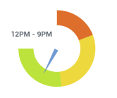
Start position | Specify the position where to start the gauge dial, by using the clock analogy, 12 am - 12 pm. You can start and end the dial at any position and build it clockwise or counterclockwise. For example, to build a standard half-circle dial, use 9 am for the start position and 3 pm ending position. To build a horseshoe shape dial, use 7 am - 5 pm.
|
End position | Specify the position where to end the gauge dial, by using the clock analogy, 12 am—12 pm. You can start and end the dial at any position and build it clockwise or counterclockwise. For example, to build a standard half-circle dial, use 9 am for the start position and 3 pm ending position. To build a horseshoe shape dial, use 7 am—5 pm. |
Range start | Specify where to start the circular bar (used for colored ranges), as a distance from the center. For example, “0” will start the colored bar right in the center, leaving no white space in the middle. Increasing the number will increase the “hole” in the center.
|
Range end | Specify the position where to end the circular bar (used for colored ranges), as a radius relative to the center. Increasing the number will increase the size of the gauge range bar moving away from the center.
|
Use this section to define the appearance of the needle that is pointing to the actual value in the meter gauge, represented by the measure in the Actual field of the Data section.
| Item | Use this item to |
|---|---|
Needle start | Define where to start the needle pointing to the actual value, as a distance from the center. Increasing this number moves the needle’s starting point farther from the center.
|
Needle end | Specify where to end the needle pointing to the actual value, as a distance from the center. This way, you can control how far it goes over the gauge axis or the colored ranges bar.
|
Start width | Specify the width of the needle starting point. The same width for start and end makes the needle look like a line/mark. |
End width | Specify the width of the needle ending point. The same width for start and end makes the needle look like a line/mark. |
Use this section to define the appearance of the needle that is pointing to the target value in the meter gauge, represented by the measure in the Target field of the Data section.
| Item | Use this item to |
|---|---|
Needle start | Define where to start the needle pointing to the target value, as a distance from the center. Increasing this number moves the needle’s starting point farther from the center.
|
Needle end | Specify where to end the needle pointing to the target value, as a distance from the center. This way, you can control how far it goes over the gauge axis or colored ranges bar.
|
Start width | Specify the width of the needle starting point. The same width for start and end makes the needle look like a line/mark. |
End width | Specify the width of the needle ending point. The same width for start and end makes the needle look like a line/mark. |
Use this section to define the labels and colors for numeric ranges of the bullet chart and meter gauge, represented by the measures in the Range 1, Range 2, and Range 3 fields of the Data section.
| Item | Use this item to |
|---|---|
Range 1 label | Specify the label for the first range. |
Range 1 color | Define the color used for the first range. |
Range 2 label | Specify the label for the middle range. |
Range 2 color | Define the color used for the middle range. |
Range 3 label | Specify the label for the last range. |
Range 3 color | Define the color used for the last range. |
Miscellaneous
Use this section to define the column settings for the visualizations from the Bar, Column, and Stock categories.
| Item | Use this item to |
|---|---|
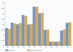
Width | Set the width of the columns relative to the entire chart data area. The value range is from 0 through 1. For example, 0.1 means that the columns cover 10% of the chart data area, and 1.0 means that the columns cover 100% of the chart data area. If the width of the columns is set to 1.0, the visualization looks as follows. If the width of the columns is set to 0.5, the visualization looks as follows. The width setting relates to the space between the categories. The space between the columns within one category is defined by the Spacing setting, which equals 1 in this example and is described further in this table. |
Spacing | Set the space between the columns within the same category (in pixels). Spacing applies if there are two or more items (measures) within the same category. Also, spacing applies if you combine a dimension (or several dimensions, for example, in the case of stacked charts) with a color dimension. |
Use this section to define the tooltip appearance.
| Item | Use this item to |
|---|---|
Show axis values | Define whether to show the measure values (used to build the visualization) in the tooltip. This option is available in the Scatterplot, Bubble, and Scatterplot Heatmap visualizations. |
Use this section to define the layout of the Treemap visualization.
| Item | Use this item to |
|---|---|
Layout | Specify the layout type for a treemap: binary tree, dice, slice, or squarified. |
Corner radius | Define the radius for the corners of the rectangles in a treemap. The bigger the corner radius, the more rounded the corners are. |
Spacing | Define the spacing between the rectangles of a treemap. |
Use this section to define the bubble animation for the hierarchical bubbles chart.
| Item | Use this item to |
|---|---|
| Collapsible | Specify whether to make the parent bubble nodes collapsible on clicking the respective bubble. |
| Item | Use this item to |
|---|---|
Marker size | Adjust the marker size by moving the slider. This setting is available for the following markers:
|
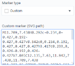
Marker type | Select the type for map markers:
|
Use this section to define the settings for the Pie and Donut visualizations.
| Item | Use this item to |
|---|---|
Inner radius | Define the inner radius of a donut, in pixels or as a percentage (as specified in the Inner radius unit field). This option is available only for the Donut visualization. |
Inner radius unit | Select the unit of measure for the inner radius value that is specified in the Inner radius field. This option is available only for the Donut visualization. |
Label radius | Define the distance between the label and the slice, in pixels. You can use negative values to put the labels directly on the slice. |















Comments
0 comments