Visualization settings (data tab)
Use the  data tab to specify the data (dataset, dimensions, and measures) needed to build a visualization widget. You can also switch to other visualization types on this tab. The
  data tab is displayed by default when you edit the widget settings.
The settings available depend on the visualization type. The following sections can be available.
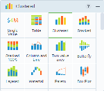
Use this section to switch to another visualization type by selecting it from a scrollable list.
When you switch to a different visualization type, all the settings already defined in the visualization settings pane stay unchanged. If more measures or dimensions (or other data) are required for a particular visualization type, the chart is not generated. You need to add all the required data that is missing.
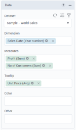
Use this section to define the data needed to build a visualization. The settings available depend on the visualization type.
| Item | Use this item to |
|---|---|
Dataset | Select or add a dataset for the visualization. Only one dataset can be used for a visualization. If a dataset is shared with you, you can view its owner’s username in parentheses next to the dataset name (for example, “Sales Orders (angie.blake)”). By changing a dataset, all the visualization properties are automatically reset. Thus, your previous selections are not retained. Note: To ensure that all datasets (your own and shared with you) are shown in the dropdown list, click You can also click To define filters for the data in the current visualization, click |
Dimension | Add dimensions (the perspectives) for data analysis in a visualization. If applicable, you can also drag measures (except for measure calculations) and use them as dimensions. For details, see About dimensions and measures. |
Group data | Specify how you want to see your data in the Table visualization. If On, the data is grouped by the selected columns. If Off, the values are shown as in the dataset. |
Columns | Add dimensions and measures to display in the columns of the Table visualization. The aggregations and format options differ from other visualizations. For details, see Table. |
Measure(s) | Add measures (numerical values that describe business events) for data analysis in a visualization. For details, see About dimensions and measures and Manage data in a visualization. If applicable, you can also drag dimensions (except for dimension calculations) and use them as measures. You can also aggregate measures, add custom calculations, and change the number format. For details, see Manage data in a visualization. |
Tooltip | Add measures to be displayed in a tooltip when you point to the data in a visualization. |
Trellis | Add a secondary dimension that divides the visualization data into separate charts for each value of the main dimension. With trellis, a chart is presented as small repetitive charts. All repetitive charts share common axis values so they can be accurately compared. Thus, you can analyze the metrics within each chart and simultaneously look at the bigger picture and compare each one with the rest of the group. This way, you can easily identify the irregular behaviors among the variables. For Single Value visualizations, add a dimension to show the numerical value of a measure for each element of the dimension. Trellis layout depends on the settings defined on the |
Color | Add a dimension to show a unique color for each value of the selected dimension. For example, if you select Store Type in this field, each store type in the dataset is marked with its own color. You can also add a measure, if applicable. You want to show the monthly gross sales per store type in a clustered bar chart.
If you select a clustering calculation, each cluster is differentiated by color. For the visualizations from the Geospatial category, define a measure that you want to be represented by marker or region color. For the Table visualization, add a measure, and then specify to which values the color should be applied: all columns, all measures, or only to the specified measure. |
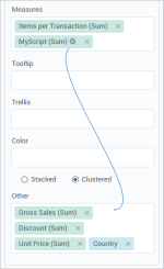
Other | Add columns that need to be included in the query scope but not used in the visualization layout. For example, you create a complex script calculation based on some columns that should not be plotted on the visualization itself. In this case, you add these columns in the Other field and select these columns in the calculation. |
Size | Depending on the visualization, do one of the following:
You can also aggregate measures and add custom calculations. |
First dimension | Add the primary dimension for a Network visualization. |
Second dimension | Add the secondary dimension for a Network visualization. |
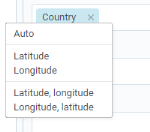
Location | Add a location dimension by which you want to group the data (country, state, city, county, and so on) in geospatial visualizations. The location can be represented by markers or regions. When adding location dimensions:
To apply a geographical role, click the location dimension, and then select a needed option: |
Location tooltip | Add a dimension that you want to use in a tooltip for locations instead of a default one. This can be helpful if you used coordinates in the Location field but want to see a store name instead of latitude and longitude details. |
Marker | Add a dimension column that contains links to images for each location dimension if you want to use a specific image for each location. For example, you can have a column with flags, each corresponding to a country. Thus, a map will plot the flags for the countries as a marker. The images can be animated SVGs if you need to add interactivity to a visualization. |
Open | Add a measure for the opening price of the stock in the stock visualizations. |
Close | Add a measure for the closing price of the stock in the stock visualizations. |
High | Add a measure for the extreme high price of the stock in the stock visualizations. |
Low | Add a measure for the extreme low price of the stock in the stock visualizations. |
Mid | Add a measure for the mid-price of the stock in the box plot (stock) visualizations. |
For details on how to add measures and dimensions, aggregate columns, format numbers or dates, add calculations, see Manage data in a visualization.
Use this section to display data values on the chart. The settings available depend on the visualization type.
| Item | Use this item to |
|---|---|
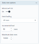
Minimized SQL | Select whether to generate SQL containing only the minimal set of tables and joins needed to obtain values for the selected columns. Minimized SQL improves visualization performance. If you need to use all the tables and joins in the query, turn this setting off. |
Select how to load data in the Table widget:
| |
Incremental load | Select the number of rows to load in one increment:
|
Rows per page | Select the number of rows per page when you use pagination in the Table widget. |
Set the maximum number of data rows to be included in a visualization query. Note: This value is limited by the Maximum rows returned in a query value that is set by your administrator in Configuration Manager. | |
| Show total | Display the total value for the data displayed in a chart. This option is available for the Waterfall visualization. |
Autorefresh | Define the autorefresh interval for the visualization (30 seconds, 1 minute, 5 minutes, or 10 minutes). If you select None, the data will not be automatically refreshed. |
“No data” message | Specify a message to display when visualization returns no data. By default, you see the “No data available” message. You can customize it when you want to be specific, for example, “No claims are available” or “There are no results for your data settings.” |
See also Visualization settings (appearance tab) and Visualization settings (advanced tab).


Comments
0 comments