Table
|
|---|
Table |

A table visualization shows the business data as a simple table (data grid) with the specified columns (dimensions and measures). The table can be used in pivot mode to help you reorganize and summarize selected columns and rows of data.
When to use
Use a table visualization to view some precise values or to compare individual data items. You can also group the data by a specific column. For practical reasons, try to limit the number of columns that you add to a table visualization. A good rule is to have all the columns visible without the need to scroll horizontally.
Use pivot mode when you want to analyze data from different perspectives to find patterns and trends in your data.
Data requirements
To create a table, define the data fields as follows:
Group data – Specify whether to group the data in the table. If On, the data is grouped by the selected columns. If Off, the values are shown as they are in the dataset.
Columns – Select one or more dataset columns. Depending on the column, select what applies:
Measure aggregation: For each measure added, select one of the supported aggregation types (none, average, count, minimum, maximum, and sum).

Hyperlinks: To format the dimension column as hyperlinks, click
 Options and select Format.
 Under Format as, select the HTML Link format type. You can specify a common label for all the column values if you don’t want to display the URLs. Additionally, you can choose how to open the link: in the same or a new window. You can customize a link color, a color to show on a link hover, and a color for the visited link.
For more information on how to add and customize hyperlinks, see Display hyperlinks in Table.

Images: For the dimensions containing images, select one of the supported format types: image as Base64, image as Hex, or image as URL. For a column, click
Options and select Format. Under Format as, select the needed option.Dates & number formats: You can change the format for numbers or dates. For details, see Format dates & numbers.
Alignment: You can change the values’ alignment in the columns. For a column, point to
Options and select Format. Under Alignment, select the needed option (left, right, center or auto).Rename for the widget: You can rename a column for the tabular layout (in other words, add a label only for visualization). For a column, click
Options and select Rename in this viz. You can add a label for each instance of the same column that has a different aggregation. For example, the column Profit (Sum) and the column Profit (Avg) each can have a specific label like “Profit” and “Average of Profit”. Also, you can use special symbols that are not allowed in the dataset columns: %, /, <, and so on. The name is not retained if you remove and then readd the renamed column.
All the selected columns appear in the table widget, and you can further reorganize them using the table bar options. If you need to add more columns to the table, then open the widget settings pane, add the needed columns in the Columns field, then click Visualize.
Tooltip – (Optional) One or more measures.
Color – (Optional) One measure. Specify to which values the color should be applied: all columns, all measures, or only to the measure that is selected in the field.


Note that for large datasets, you can choose to load data into the Table widget incrementally. The feature improves performance but has some limitations. For details, see Data loading.
Use case
You want to show the gross sales and sales costs for each department in the store types where your company sells its goods. Add a table visualization with the following columns from the dataset: Gross Sales, Sales Costs, Department, and Store Type.
The table looks as follows.

Now, to view information summarized by department, you can group the table by the Department column.

You can also distribute data by adding other columns in table headers, for example, to compare data by year. For details on how to perform further manipulations with data columns and rows, see the following topics.
Working with the Table options
Review the following topics to learn about table views and capabilities:
Include or exclude
Point to the column header, click
 Options, and then click
  Columns tab to show or hide columns in the table. You can start typing in the Filter field to search for the needed column name.
Pin
You can set the column to be fixed to the left or right so that it remains visible when you scroll the table horizontally.
Point to the column header, click
Options, then click Pin Column, and select where to pin.
Sort
To sort any column, click its header. The arrow appears next to the column name, indicating the sorting order. If no arrow is displayed, the column is not sorted.

Reorder
Drag the column header to change its order.


For further details on table column options, see References.
Point to the column header, click Options, and then click the  Filters tab.
Depending on the column type, filtering options are as follows:
For measure columns, you can use the following expressions: Equals, Not equal, Less than, Less than or equals, Greater than, Greater than or equals, In range.

After you define one filtering condition, you can use AND or OR operators to add a second condition.

To remove a filter, just delete the values that you entered in the fields.
For dimension columns, use the dropdown list to select or deselect needed values in the column.


After you apply a filter, a filter icon appears next to the column name. To edit the filter, click Options, and then click the Filters tab.

Grouping rows allows you to collapse and expand related data to create effective views. Grouping is not supported for the incremental data loading (see Data loading).
Point to the header of a dimension column, click
Options, and then click Group by [column name].
Note: You can also drag the column directly to the toolbar, or to the Rows section in the sidebar. The toolbar and sidebar are available if the corresponding settings are turned on in the widget settings pane.
Repeat the same step for adding another level of grouping.
View the hierarchy of the groups in the toolbar. You can drag column headers to rearrange the grouping order, or remove columns from grouping.

To expand or collapse all grouped data in a column, point to the column header, click
Options and select the corresponding option.


To work with pivoting, ensure that the Pivoting option is enabled under the Sidebar section of the widget settings pane. Also, we recommend switching to the storyboard view mode. Pivoting is not supported for the incremental data loading (see Data loading).
In the Columns pane, turn on Pivot Mode.

After you switch to pivot mode, notice that only the measures are preselected so that you can choose which dimension columns to use for grouping.

Reorganize your data in several ways:
Row grouping
To choose the column for row grouping, drag the column name to the toolbar or to the Rows section of the sidebar. You can also select the checkbox next to the column name on the sidebar (selecting another column will add another level of grouping).

View the hierarchy of the groups in the toolbar. Here, you can drag the column handles to rearrange the grouping order, or to remove columns from grouping.
Column grouping
To distribute data vertically by a column, on the sidebar, drag the column handle to the Columns section (1).
The values of the selected column appear as new column headers (2). In the following example, the Store Type column has three values, and they are added as new columns.

To add more grouping columns, on the sidebar, drag the column handles to the Columns section. For example, adding Sales Date will add distribution by year for each store type.


To export data from a table, right-click anywhere in a row and select one of the following:
Copy – Copy the current table row and paste it into a document.
Optionally, to copy a row, you can press Ctrl+C. To select multiple rows, hold Ctrl and click the rows you want to copy. Then, click Copy.
Copy with Headers – Copy the table row with its column headers.
To select multiple rows, hold Ctrl and click the rows you want to copy. Then, click Copy with Headers.
Export – Save the whole table in the following file formats (.csv, .xlsx, or .xml).

The following is an example of the pivot table exported into an Excel file.

Display hyperlinks in Table
Using the Table widget, you can display column values as hyperlinks and generate custom links based on the columns. Review the following use cases to get more details.
In your dataset, you have a column with the URLs that you want users to be able to open.
In the Table widget, select the column containing hyperlinks.
For a column, click
Options and select Format. Under Format as, select HTML Link.
Specify the label for the link if you don’t want to use the URL itself.
Select how you want to open the link: in a new window/tab or in the same window.
Click Visualize.
As a result, the column values are now displayed as hyperlinks.
You can add a hyperlink directly as a calculation.
In the Table widget, add a new dimension calculation.
In the calculation, type something similar to:
'<a href=https://www.example.com target=_blank>Click me</a>'Don’t add quotation marks for the attributes.
Click Visualize.
As a result, the column shows a hyperlink called “Click me” that will open a URL (www.example.com) in a new tab (target=_blank).

You can further customize how the hyperlink is displayed. For example, you can add an image in front of it and use column values.
'<img src=https://cdn4.iconfinder.com/data/icons/icocentre-free-icons/137/f-check_256-512.png height=12px width=auto/> <a href=https://example.com target=_blank> '||[Department]||' <a/> '

Let’s say you have a base URL (www.example.com/claims) and you want to use another column as a part of the URL, for example, [Claim ID]. Thus, the final URL would be “www.example.com/claims/1234”, where “1234” is a value of a column.
In this example, let’s create links to country descriptions in Wikipedia. You have the base URL “https://en.wikipedia.org/wiki/”. By using a calculation, let’s add a country name to the end of the URL.
In the Table widget, add a new dimension calculation.
In the calculation, type the following:
'https://en.wikipedia.org/wiki/'||[Country]
For a column, click
Options and select Format. Under Format as, select HTML Link.

Click Visualize.
As a result, the column is now generated based on the calculation and formatted as a hyperlink. Each link opens a corresponding country description.


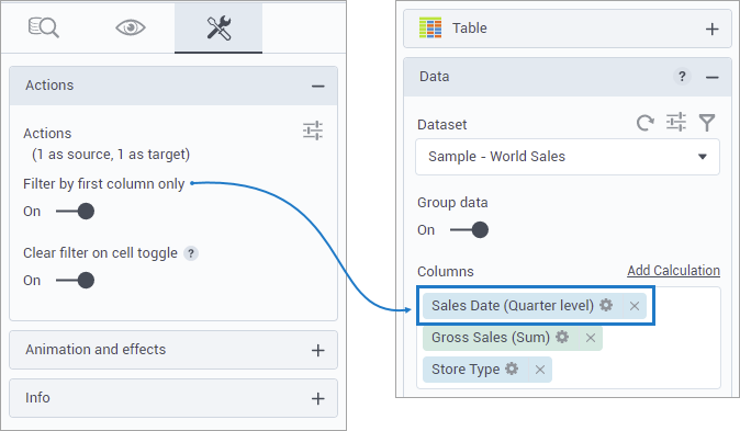
Use filtering actions in Table
If you add a filtering action for the Table widget, you have the following additional options:
You can filter only by one column regardless of the cell that you click.
You can place the column anywhere on the Table layout or even hide it. However, you need to put it first in the Columns field and set the Filter by first column only option to On.

You can choose not to clear the filter by clicking the same cell again. This might be helpful when you want the filter to be always applied. For example, you filter other widgets for specific data items, and clearing the filter, in this case, will show no data.
For more information on these options, see Visualization settings (advanced tab).
Example:

In the video example:
Clicking a cell in the Sales Date column filters the data by date (Q3 2019).
Clicking a cell in the Store Type column filters the data by store (Mall).
Setting the option to filter by the first column to On.
Clicking a cell in any of the columns (Sales Date or Store Type) filters the data by Sales Date (Q3 2019). Each subsequent click clears the filter.
References
For details on table column options, toolbar options, and sidebar options, see the following topics:
To open the column options menu, point to a column header of the generated table, and then click Options.
| Item | Use this item to |
|---|---|
Pin column | Set the column to be fixed to the left or right so that it remains visible when you scroll horizontally to see other columns. |
Value aggregation | Change the aggregation of the measures in the grouped rows to one of the following types: Average, Count, First, Last, Minimum, Maximum, Sum. |
Autosize this column | Autosize the current column to the longest value in the column (the header is not considered). Alternatively, you can drag the right border of the column header cell. |
Autosize all columns | Autosize all the columns to the longest value in the column (header is not considered). |
Group by [column name] | Group the rows by the values in the current column. |
Reset columns | Reset the order of the columns, column size, pinned columns, and aggregation to the state the table was in when you last clicked Visualize. |
Expand all | Expand all row groups. This option appears when you use the grouping option. |
Collapse all | Expand all row groups. This option appears when you use the grouping option. |
To make all the options of the sidebar visible, select the Filtering and Pivoting options in the Sidebar section of the widget settings pane.
On the sidebar, on the Columns tab, you can turn on pivot mode, search for columns, show or hide columns in the table. For details on pivoting options, see Use pivot mode.

On the Filters tab, you can set filtering conditions for measures or select needed values for dimensions. For details, see Filter data in columns.

To make a toolbar visible in the table view, select Always or When grouping in the Toolbar section of the widget settings pane.
To allow navigating a table by pages instead of scrolling vertically through all the rows, turn on the pagination bar in the Pagination section of the widget settings pane. The pagination bar appears at the bottom of the table.
For details on how to customize your visualization, see Visualization settings.
For a whole list of visualizations, see the following topics:
- Visualizations by function (find a visualization to suit your business case)
- Visualizations by type (find a visualization based on how it is organized on the interface)
Comments
0 comments