Rotated area chart
|
|---|
Rotated area chart |
A rotated area chart is used to analyze one or more measures across a dimension, typically time, and to show trends. This chart is recommended when you need an overview of the data and not exact values.
As opposed to the area chart, where the plot is above the x-axis, the rotated area chart is plotted horizontally, to the right of the y-axis. The colors highlight the magnitude of change over time or across another dimension.
A rotated area chart is best used to suit the following cases:
- The data labels are very long and may look crowded on the x-axis.
- The number of measures that you want to display is very large.
- You want to show a large differentiation in value between the measures.
When to use
Use the rotated area chart to emphasize the difference in value between two related data series, such as the following items:
- Gross and net sales over time
- Profit and planned profit either over time, country, or store type
- Manufacturing cost and profit over time
Data requirements
To build this chart, define the data fields as follows:
- Dimension – One dimension
- Measure – One or more measures
- Tooltip – (Optional) One or more measures
- Trellis – (Optional) One dimension
- Color – (Optional) One dimension
Use case
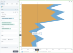
The following chart shows the difference between the actual gross sales and the planned gross sales for each month, over a year.
In this use case, the overall trend is more important than the individual values of the two measures. The data is judged by the areas plotted horizontally: the wider the area, the larger the value of the measure. In this chart, the widest areas correspond to January, March, and May: the actual gross sales for these three months have the biggest values. The trend that you can notice is that starting June, the gross sales decrease considerably. Also, the actual gross sales exceed the planned gross sales in all months.
References
For details on how to customize your visualization, see Visualization settings.
For a whole list of visualizations, see the following topics:
- Visualizations by function (find a visualization to suit your business case)
- Visualizations by type (find a visualization based on how it is organized on the interface)


Comments
0 comments