Clustered chart
|
|---|
Clustered bar chart |
|
|---|
Clustered column chart |
A clustered bar (column) chart compares one or more measures across one or two dimensions.
When multiple measures are compared, the chart shows multiple bars or columns, grouped in clusters. The bars or columns represent the measures. The clusters represent the dimensions (for example, geographical location, store type, product line, and so on). The measures that you select for your dimensions must be comparable, that is, they should use the same unit of measurement and be close enough in amounts to be shown together on the chart.
If you select one measure for this chart, it will function as a standard bar (column) chart showing the individual bars or columns side by side.
When to use
The clustered bar (column) chart can be used for the following business needs:
- Compare sales to the sales forecast for several countries. Each cluster (a country) has two bars or columns (sales and sales forecast).
- Compare quarterly sales for three products. Each cluster (a quarter) has three bars or columns. Each bar or column represents a product.
When you have too many elements in a category, the chart becomes more complex visually. Ensure that you use a reasonable number of elements to compare. Thus, you benefit from the whole view of the data trend, without having to scroll through the chart.
A bar chart displays data as horizontal bars, while a column chart displays data as vertical bars. However, the data is processed the same way.
The following table shows the main differences between the two chart types.
| Use column charts to | Use bar charts to |
|---|---|
|
|
Data requirements
To build this chart, define the data fields as follows:
- Dimension – One or two dimensions. The order of dimensions matters. The first dimension represents the main grouping option.
- Measure – One or more measures
- Tooltip – (Optional) One or more measures
- Trellis – (Optional) One dimension
- Color – (Optional) One dimension
Use case
View the following use cases for the clustered chart, based on the chart orientation.
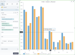
The following chart shows the actual profit versus the planned profit, by country.
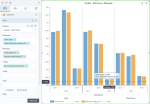
The following chart shows the actual profit versus the planned profit for each store type, grouped by department. Notice that the clusters are created for each store type, which is the second dimension in the field, and are grouped by department, which is the first dimension.
In the following example, the first dimension is now the store type. As a result, the clusters are created per each department and grouped by store type.
In all the above use cases, the bar chart is preferred to the column chart because the dimension is not related to time, and it has data with long labels. Also, in these cases, you can notice better the big differences among the values of the measures.
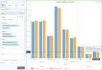
The following chart shows the actual profit versus the planned profit, by month.
The following chart shows the actual profit versus the planned profit by year, grouped by store type. Notice that the clusters are created for every year, which is the second dimension in the field, and are grouped by store type, which is the first dimension.
In the following example, the first dimension is now the sales date (the year number). As a result, the clusters are created per store type and grouped by year.
In the column chart use cases above, the column chart is preferred because time values are better understood when they are graphically represented from left to right. Also, in these cases, the trends are more visible than in a bar chart.
References
For details on how to customize your visualization, see Visualization settings.
For a whole list of visualizations, see the following topics:
- Visualizations by function (find a visualization to suit your business case)
- Visualizations by type (find a visualization based on how it is organized on the interface)


Comments
0 comments