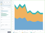
Stacked area chart
|
|---|
Stacked area chart |
A stacked area chart shows two or more measures across one dimension. This chart type displays measures placed on top of each other. Each measure is represented by a different color and is stacked on top of another measure. The height of each colored stack corresponds to its value. The top edge of each stacked area represents the cumulative total of that measure and all the measures beneath it.
This chart is best used to show part-to-whole relationships or to illustrate how a part-to-whole distribution changes over time or over another dimension.
When to use
You can use this chart to illustrate the distribution of the following measures within a dimension:
- Sales and marketing costs, travel expenses, and entertainment costs – within the operating cost for each department.
- Building rent, insurance costs, subscriptions, and utilities – within the administrative expenses for each city.
- Operating and non-operating costs – within the total costs for each line of business and country.
Data requirements
To build this chart, define the data fields as follows:
- Dimension – One dimension
- Measure – Two or more measures
- Tooltip – (Optional) One or more measures
- Trellis – (Optional) One dimension
- Color – (Optional) One dimension
Use case
The following chart shows the distribution of the various types of costs over a year, or in other words, how each measure contributes to the cumulative total of all costs.
References
For details on how to customize your visualization, see Visualization settings.
For a whole list of visualizations, see the following topics:
- Visualizations by function (find a visualization to suit your business case)
- Visualizations by type (find a visualization based on how it is organized on the interface)


Comments
0 comments