Pareto chart
|
|---|
Pareto bar chart |
|
|---|
Pareto column chart |
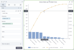
A Pareto chart shows dimensions represented by bars or columns in descending order and a line representing the cumulative percentage of these dimensions.
In a Pareto bar chart, the size of the bars corresponds to the value of the measure (for example, frequency, cost, or time) that is displayed on the secondary horizontal axis. The primary horizontal axis is always 100% and represents the percentage shown by the line.
In a Pareto column chart, the size of the column corresponds to the value of the measure (for example, frequency, cost, or time) that is displayed on the primary vertical axis. The secondary vertical axis is always 100% and represents the percentage shown by the line.
A Pareto chart provides facts needed for prioritization by showing the relative importance of various problems or their causes. The highest bars (columns) are the most important. The chart is based on the Pareto principle, which states that out of several factors that affect a situation, a few factors impact the situation the most. The Pareto principle describes a phenomenon in which 80 percent of the result can be explained by 20 percent of the causes.
When to use
The Pareto chart can be used for the following business needs:
- Determine which products contribute to sales the most.
- Determine what business problems create most of the complaints or losses.
- Analyze the causes of late shipment arrival (traffic, weather, address errors, transportation failures, and so on): number of occasions and how each reason for delay contributes to the total.
A bar chart displays data as horizontal bars, while a column chart displays data as vertical bars. However, the data is processed the same way.
The following table shows the main differences between the two chart types.
| Use column charts to | Use bar charts to |
|---|---|
|
|
Data requirements
To build this chart, define the data fields as follows:
- Dimension – One dimension
- Measure – One measure
- Tooltip – (Optional) One or more measures
- Trellis – (Optional) One dimension
Use case
View the following use cases for the Pareto chart, based on the chart orientation.
References
For details on how to customize your visualization, see Visualization settings.
For a whole list of visualizations, see the following topics:
- Visualizations by function (find a visualization to suit your business case)
- Visualizations by type (find a visualization based on how it is organized on the interface)


Comments
0 comments