Layered chart
|
|---|
Layered bar chart |
|
|---|
Layered column chart |
A layered bar (column) chart compares two measures across one or two dimensions. The measures are shown as overlapping bars or columns (one behind the other), and they should share the same scale and unit of measurement.
If you use two dimensions for the chart, the measures are grouped by these dimensions according to their order.
For example, if you have the Country and Store Type dimensions defined in this order, the chart shows the bars or columns grouped by country, and, for each country, the bars or columns are grouped by store type.
If Store Type is the first dimension, the chart shows the bars or columns grouped by store type, and, for each store type, the bars or columns are grouped by country. However, in that case, the chart can be read easily if the number of countries is low (up to five countries).
When to use
The layered bar (column) chart can be used to compare the following aspects:
- Gross sales and planned gross sales over time and across the store type
The total number of motor vehicles registered compared to the number of cars registered by county (or province)
If you have two dimensions, a good rule is to set the dimension with a larger number of elements as the first dimension.
A bar chart displays data as horizontal bars, while a column chart displays data as vertical bars. However, the data is processed the same way.
The following table shows the main differences between the two chart types.
| Use column charts to | Use bar charts to |
|---|---|
|
|
Data requirements
To build this chart, define the data fields as follows:
- Dimensions – One or two dimensions. The order of the dimensions matters. The first dimension represents the main grouping option.
- Measures – Two measures. The order of the measures matters. The columns that represent the first measure are behind the columns that represent the second measure.
- Tooltip – (Optional) One or more measures
- Trellis – (Optional) One dimension
Use case
View the following use cases for the layered chart, based on the chart orientation.
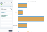
The following chart shows the planned profit and the actual profit, per department.
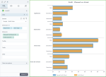
The following chart shows the planned profit and the actual profit, per department and store type. Notice that the bars are grouped by department, and, for each department, the bars are grouped by store type.
The following chart shows the planned profit and the actual profit, per store type and department. In this case, the bars are grouped by store type, and, for each store type, the bars are grouped by department.
In all the above use cases, the bar chart is preferred to the column chart because the dimension is not related to time, and it has data with long labels. Also, in these cases, you can notice better the big differences between the values of the measures.
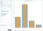
The following chart shows the planned profit and the actual profit per quarter.
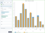
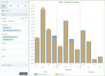
The following chart shows the planned profit and the actual profit per quarter and store type. Notice that the columns are grouped by quarter, and, for each quarter, the columns are grouped by store type.
The following chart shows the planned profit and the actual profit per store type and quarter. In this case, the columns are grouped by store type, and, for each store type, the columns are grouped by quarter.
In the column chart use cases above, the column chart is preferred because time values are better understood when they are graphically represented from left to right.
References
For details on how to customize your visualization, see Visualization settings.
For a whole list of visualizations, see the following topics:
- Visualizations by function (find a visualization to suit your business case)
- Visualizations by type (find a visualization based on how it is organized on the interface)



Comments
0 comments