Bar (column) and line chart
|
|---|
Bar and line chart |
|
|---|
Column and line chart |
A bar (column) and line chart is a combination of a bar (column) chart and a line chart. It shows the relationship between two or more measures across one or two dimensions. The measures should be comparable and share the same scale and units of measurement. Use this type of chart to emphasize the measure represented by the line or to make it stand out from the other measures.
When to use
The bar (column) and line chart can be used for the following business needs:
- Compare the planned and actual sales profits by year or city.
- Show the total number of transactions versus the total number of units sold (if the scale is similar).
Compare the target and actual bonuses earned by a sales agent during a certain period of time.
A bar chart displays data as horizontal bars, while a column chart displays data as vertical bars. However, the data is processed the same way.
The following table shows the main differences between the two chart types.
| Use column charts to | Use bar charts to |
|---|---|
|
|
Data requirements
To build this chart, define the data fields as follows:
- Dimension – One or two dimensions. The order of dimensions matters. The first dimension represents the main grouping option.
- Measure – Two or more measures. The order of measures matters. The last measure is presented by a line.
- Tooltip – (Optional) One or more measures
- Trellis – (Optional) One dimension
Use case
View the following use cases for the bar (column) and line chart, based on the chart orientation.
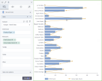
The following chart shows the relationship between the profit and the gross sales per product type. The line on the chart follows a similar pattern as the columns: the larger the value of the sales, the bigger the profit.
In this case, the bar chart is preferred to the column chart because the dimension is not related to time, and it has data with long labels. Also, in this chart type, you can notice better the big differences between the measure values of the product types.
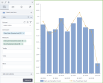
The following chart shows the correlation between the number of items per transaction and the number of customers over time (by quarter). The line on the chart follows a similar pattern as the columns: the larger the number of customers is, the more items per transaction are sold.
In this case, the column chart is preferred because time values are better understood when they are graphically represented from left to right.
References
For details on how to customize your visualization, see Visualization settings.
For a whole list of visualizations, see the following topics:
- Visualizations by function (find a visualization to suit your business case)
- Visualizations by type (find a visualization based on how it is organized on the interface)


Comments
0 comments