Filled & Pointer map
|
|---|
Filled & Pointer map |
A filled & pointer map is a combination of both the filled map and the pointer map, where you can visualize up to three numeric values (region color, pointer color, and pointer size) based on the same or different location dimensions. For example, you can color the regions based on the number of customers per each country, and at the same time show pointers per each city in a country with the same measure or a different one.
When to use
Use a filled & pointer map when you want to present the geographical distribution of your numeric data by coloring regions and compare other values by plotting pointers.
You can use it also when you need a filled map and display images for each specific location, like a manager avatar per country or city, or any other image representing a location. For that, you will need to have these images defined in the dataset column.
Using many unrelated measures at the same time can make the map hard to read.
Data requirements
To build this chart, define the data fields as follows:
To define filled regions:
Region location – One or multiple geographical dimensions.
Depending on what regions you want to visualize, you can choose the appropriate map (a specific country, for example) on the
 appearance tab.
Region color – (Optional) One measure that defines the region’s color.
Region tooltip – (Optional) One or more measures to show in a tooltip when you point to a region.
To define pointers:
Pointer location – One or multiple geographical dimensions.
Consider the following when adding location dimensions:
- Names – To create markers for cities, you can drag a dimension called City, for example. Add multiple dimensions, for example, Country and City, to improve geocoding results for the datasets containing cities with the same names but in different countries. For example, if you have Paris in France and Paris in the USA, they will be plotted appropriately.
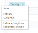
- Coordinates – If you have columns with coordinates, drag them and click to apply their geographical role. Including coordinates results in faster performance and adds more flexibility in defining marks.
Pointer size – (Optional) One measure that defines the marker size.
Pointer color – (Optional) One measure that defines the marker color.
Note: For this chart type, you need to set a rule for calculating the color range: by rank or by value. For details, see the Color range in the Palette and style section in Visualization settings (appearance tab).
Pointer marker – (Optional) One dimension column that contains links to SVG images for each location dimension.
This can be helpful if you want to use a specific image for each location. For example, you can have a column with flags corresponding to a country. Thus, a map will plot the flags for the countries as a marker. The images can be animated SVGs if you need to add interactivity to a visualization.
Pointer tooltip – (Optional) One or more measures.
Pointer location tooltip – (Optional) One dimension that you want to use as a tooltip when pointing to a location pointer. This can be useful if you want to override the default dimension tooltips taken from the Pointer location field. This may apply when you have coordinates of offices and want to use the office’s name as a tooltip instead of the latitude and longitude details.
Use case
The following chart shows the number of customers in each country where the company sells goods. By pointing to a country area, you can view the exact values. Each country has the manager avatar (instead of a pointer) responsible for the customers in that country.
You can change the colors for the map background, the type of markers, their relative size, and perform many other customizations. These options are available on the  appearance tab of the visualization settings pane.
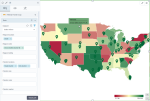
The following map colors each state according to the gross sales. Additionally, we added the city pointers to see the locations of the physical stores.
References
For details on how to customize your visualization, see Visualization settings.
For a whole list of visualizations, see the following topics:
- Visualizations by function (find a visualization to suit your business case)
- Visualizations by type (find a visualization based on how it is organized on the interface)


Comments
0 comments