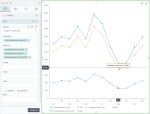
Stacked line chart
|
|---|
Stacked line chart |
A stacked line chart compares two or more measures across one dimension (which is usually a time interval). The chart lines do not intersect because they are cumulative at each data point. With each additional line, the values are added to the values of the previous lines for each point. The measures must be comparable and share the same scale and units of measurement.
When to use
Use a stacked line chart to show how parts of a whole change over time (or compared to another category) or to compare proportions within a whole.
Data requirements
To build this chart, define the required and optional data fields as follows:
- Dimension – One dimension
- Measure – Two or more measures
- Tooltip – (Optional) One or more measures
- Trellis – (Optional) One dimension
- Color – (Optional) One dimension
Use case
The following chart shows the distribution of travel expenses, marketing costs, and entertainment costs over a year. The chart illustrates how each measure contributes to the cumulative total—the operating cost—and shows the trend for each measure.
References
For details on how to customize your visualization, see Visualization settings.
For a whole list of visualizations, see the following topics:
- Visualizations by function (find a visualization to suit your business case)
- Visualizations by type (find a visualization based on how it is organized on the interface)


Comments
0 comments