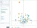
Bubble chart
|
|---|
Bubble chart |
A bubble chart shows three dimensions of data: the position (x and y axes) and the size of the data point (bubble). A bubble chart does not use a category axis — both horizontal and vertical axes are value axes. Colors can also be used to distinguish between categories or represent an additional data dimension.
When to use
The bubble chart is primarily used to analyze the patterns and correlations of different measures. Bubble charts can facilitate the understanding of social, economic, medical, and other scientific relationships, for example:
- How revenue and consumer rating correlate for different products
- Correlation between greater advertisement spending and sales as the year progressed (quarters are placed on the horizontal axis)
- Correlation between sugar and fat intake with obesity for different countries.
A bubble chart has a limited data size capacity. It is hard to read the chart with too many bubbles. You can increase the readability of the chart by adding a filter widget to limit data to display.
Data requirements
To build this chart, define the data fields as follows:
- Size – One measure
- Measures – Two measures
- Dimension – One or more dimensions
- Tooltip – (Optional) One or more measures
- Color – (Optional) One dimension
Use case
The following chart shows the discount and gross sales per product type. The size of the bubble represents the number of customers. The bubble color represents a store type.
References
For details on how to customize your visualization, see Visualization settings.
For a whole list of visualizations, see the following topics:
- Visualizations by function (find a visualization to suit your business case)
- Visualizations by type (find a visualization based on how it is organized on the interface)


Comments
0 comments