Scatterplot chart
|
|---|
Scatterplot chart |
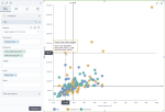
A scatterplot chart shows a potential relationship between two sets of data. The data is displayed as a collection of points. Each point has two values that are measures for the selected dimension. The first value determines the position on the horizontal axis, and the second value determines the position on the vertical axis. If the points are color-coded, one additional variable can be used. For example, you have several countries (dimension) and you want to see how the GDP per capita (one measure) correlates with life expectancy (another measure).
Depending on the points’ positions, a scatterplot chart can show various types of correlation in your data. The strength of the correlation is determined by how closely packed the points are to each other. Points that are outside the general cluster of points are outliers.
For example, you have “education level” and “income” measures for a number of people. Depending on your data, you can have the following correlation types:
- Positive – The pattern of points slopes from lower left to upper right. This means that higher incomes correspond to higher education levels and lower incomes correspond to fewer years of education.
- Negative – The pattern of points slopes from upper left to lower right. This means that the most highly educated individuals have lower incomes than the least educated individuals.
- No correlation – Scatterplot does not indicate any trends. Points are scattered all over the chart.
When to use
Scatterplots are useful for interpreting trends in statistical data when you have paired numerical data. By using this chart, you can see if one variable impacts the other. For example, you can find a relationship for the following cases:
- Ice cream sales and day temperature
- Sales against the cost of different products
- The sales for a product and the cost of advertisement campaigns
- Cost and sales for different countries
- Number of hours studying and the test score for a group of students
However, correlation does not necessarily mean causation, and another variable may be influencing results.
Data requirements
To build this chart, define the data fields as follows:
- Dimension – One or more dimensions
- Measures – Two measures
- Tooltip – (Optional) One or more measures
- Color – (Optional) One dimension
Use case
The following chart shows how the unit price correlates with gross sales, per product type. The store type is color-coded as an additional dimension. The Show quadrant option is selected in the Data guides section to show how the values are distributed according to the median values.
References
For details on how to customize your visualization, see Visualization settings.
For a whole list of visualizations, see the following topics:
- Visualizations by function (find a visualization to suit your business case)
- Visualizations by type (find a visualization based on how it is organized on the interface)


Comments
0 comments