Scaling edges network chart
|
|---|
Scaling edges chart |
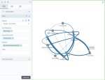
A scaling edges network chart shows how entities are interconnected through the use of nodes and connecting lines. The round nodes are the entities that represent two dimensions. The lines between the nodes show the relationships between the entities related to the first dimension and the entities related to the second dimension. The thickness of the lines depends on the values of the measure specified in the chart settings. A larger value means a thicker line.
When to use
Use a scaling edges network chart to visualize complex relationships between a number of entities (for example, social media communicators, transportation routes, companies, or products), including a numeric characteristic (for example, the number of social media posts about a product or the number of deliveries between the company locations on a transportation route) in your chart.
Data requirements
To build this chart, define the required and optional data fields as follows:
- First dimension – One dimension
- Second dimension – One dimension
- Measure – One measure
Important: This widget can visualize up to 100 data rows.
Use case
The following chart shows the connections between the store types (the first dimension) and product lines (the second dimension). By pointing to any of the lines, you can view the number of customers for a specific product line and store type.
Tip: Each time you click Visualize (without changing the settings), the application presents the chart differently to give the user a different view of the same data. You can also drag the chart to view it from different sides.
References
For details on how to customize your visualization, see Visualization settings.
For a whole list of visualizations, see the following topics:
- Visualizations by function (find a visualization to suit your business case)
- Visualizations by type (find a visualization based on how it is organized on the interface)


Comments
0 comments