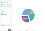
Pie and donut charts
|
|---|
Pie chart |
|
|---|
Donut chart |
A pie chart shows proportions between categories by dividing a circle (pie) into proportional segments (slices). The full circle represents 100% of the data. In the pie charts, you evaluate the pieces according to their areas.
The donut chart is similar to the pie chart, except that it does not have a central point, and you evaluate each piece according to its length. The donut chart is similar to a stacked bar chart that has been curled around itself.
When to use
Use a pie or donut chart to compare categories that are parts of a whole. The categories on a chart must be mutually exclusive and not overlapping. For example, a pie or donut chart can be used to compare the profitability of different departments inside a company. However, a pie or a donut chart is not suitable for comparing different companies to each other that are not parts of a whole (because the number of companies is not limited).
For better chart readability, use data with up to five categories that are represented by slices. A pie or a donut chart is not useful if the values are close to each other. For example, slices for 32%, 33%, and 35% look very similar.
Data requirements
To build any of these charts, define the data fields as follows:
- Dimension – One dimension
- Measure – One measure
- Tooltip – (Optional) One or more measures
- Trellis – (Optional) One dimension
Use case
The following chart shows how each department contributes as percentages to the whole 100% of gross sales.
The same data is visualized by using the donut chart.
References
For details on how to customize your visualization, see Visualization settings.
For a whole list of visualizations, see the following topics:
- Visualizations by function (find a visualization to suit your business case)
- Visualizations by type (find a visualization based on how it is organized on the interface)


Comments
0 comments