Butterfly area chart
|
|---|
Butterfly area chart |
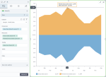
A butterfly area chart is used to compare two measures across a dimension, and to show trends. The two measures are plotted side by side along a horizontal axis. The areas between the horizontal axis and the plotted lines are filled with color to indicate volume.
This area chart type is best used to depict a time-based relationship. Thus, you can use it to show trends over time among related measures.
When to use
Use the butterfly area chart to compare the trend of two related data series and not their exact values. For example, you can compare gross and net sales over time.
Data requirements
To build this chart, define the data fields as follows:
- Dimension – One dimension
- Measures – Two measures
- Tooltip – (Optional) One or more measures
- Trellis – (Optional) One dimension
Use case
The following chart shows the overall trend of gross sales and planned gross sales over time, as opposed to individual data point values. The overall shape of the areas indicates that both measures are almost halved starting September, compared to the previous months.
References
For details on how to customize your visualization, see Visualization settings.
For a whole list of visualizations, see the following topics:
- Visualizations by function (find a visualization to suit your business case)
- Visualizations by type (find a visualization based on how it is organized on the interface)


Comments
0 comments