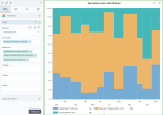
Marimekko chart
|
|---|
Marimekko chart |
A Marimekko chart is used to show multiple measures across a dimension. This chart type represents a single rectangle composed of colored stacked columns of different widths. The columns represent the elements of the dimension and are split into horizontal segments, which represent the measures. Each measure is represented by a different color. The height of each color is proportional to the total value of the column. The y-axis shows 100%. The width of each column is proportional to its value within the dimension.
This chart type is best used to analyze several aspects within a single visualization:
- The contribution of each measure to each category
- The contribution of each category to the whole
When to use
The Marimekko chart can be used to show the following aspects:
- The total operating cost of the company, split by cost type and by country
- The total expenses of the company per department and per month
- The investment values per investment type and per country
Data requirements
To build this chart, define the data fields as follows:
- Dimension – One dimension
- Measures – Two or more measures
- Tooltip – (Optional) One or more measures
- Trellis – (Optional) One dimension
Use case
The chart in this use case shows the following aspects related to the company's operating cost:
- The cost types that constitute the operating cost, on the y-axis (the available cost types are represented by different colors)
The months for which the operating cost is evaluated, on the x-axis.
The height of a color stack represents the proportion of a cost type in relation to the operating cost for that month. For example, in April, the sales and marketing cost has the largest share in relation to the operating cost, followed by the travel cost, and the entertainment cost.
The widest column corresponds to September. This means that the operating cost generated in September has the highest value when compared to any other month of the year.
References
For details on how to customize your visualization, see Visualization settings.
For a whole list of visualizations, see the following topics:
- Visualizations by function (find a visualization to suit your business case)
- Visualizations by type (find a visualization based on how it is organized on the interface)


Comments
0 comments