Treemap chart
|
|---|
Treemap chart |
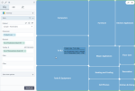
A treemap chart plots values of a specified dimension as rectangles whose areas are proportional to the values of the selected measure.
When to use
Use a treemap chart to visualize hierarchical data that are parts of a whole. The categories on a chart must be mutually exclusive and not overlapping. For example, you can compare the profitability of a company’s product lines that include specific products. For better chart readability, use data with up to five categories that are represented by segments.
Data requirements
To build this chart, define the data fields as follows:
- Dimension – One dimension
- Measures – One measure
- Tooltip – (Optional) One or more measures
- Color – (Optional) One dimension
Use case
The following chart shows the number of customers by product line. The product line with the highest number is the first rectangle on the left, which is followed by other tiles plotted in descending order (right and down).
References
For details on how to customize your visualization, see Visualization settings.
For a whole list of visualizations, see the following topics:
- Visualizations by function (find a visualization to suit your business case)
- Visualizations by type (find a visualization based on how it is organized on the interface)


Comments
0 comments