Waterfall chart
|
|---|
Waterfall bar chart |
|
|---|
Waterfall column chart |
A waterfall bar (column) chart shows how an initial value either increases or decreases through a series of changes, leading to a final value. The initial and final values are shown as columns, and the changes are displayed as floating bricks. The columns are color-coded to distinguish positive and negative numbers.
When to use
The waterfall chart can be used for the following business needs:
- Analyze profit & loss for a company for a year
- Analyze cash-flow statements
- Illustrate the beginning and the ending headcount for a company in a year
- Make an inventory or sales analysis
A bar chart displays data as horizontal bars, while a column chart displays data as vertical bars. However, the data is processed the same way.
The following table shows the main differences between the two chart types.
| Use column charts to | Use bar charts to |
|---|---|
|
|
Data requirements
To build this chart, define the data fields as follows:
- Dimension – One dimension
- Measure – One measure
- Tooltip – (Optional) One or more measures
- Trellis – (Optional) One dimension
Use case
View the following use cases for the waterfall chart, based on the chart orientation.
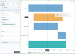
The following chart shows the gross sales variance (gross sales minus planned gross sales) by department. In the image below, the positive values are blue, and the negative values are orange.
Note: This chart uses a calculation, Gross Sales Variance (total). For details on how to add calculations in a visualization, see Add calculations.
In this case, the bar chart is preferred to the column chart because the dimension is not related to time, and it has data with long labels.
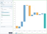
The following chart shows the profit variance (profit minus planned profit) by quarter. In the image below, the positive values are blue and the negative values are orange.
Note: This chart uses a calculation, Profit Variance (total). For details on how to add calculations in a visualization, see Add calculations.
In this case, the column chart is preferred because time values are better understood when they are graphically represented from left to right.
References
For details on how to customize your visualization, see Visualization settings.
For a whole list of visualizations, see the following topics:
- Visualizations by function (find a visualization to suit your business case)
- Visualizations by type (find a visualization based on how it is organized on the interface)


Comments
0 comments