Bullet chart
|
|---|
Bullet bar chart |
|
|---|
Bullet column chart |
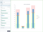
A bullet chart compares the performance of one measure to the other related measure. You can also add a dimension to compare measures for each dimension value. Additionally, the measures can be evaluated according to the defined qualitative ranges, such as poor, average, and good.
A bullet chart consist of the following elements:
- Bar/column length – A value of interest, such as actual value (actual gross sales). If you use dimension, you will see a bar/column per each dimension value.
- Line crossing the bar/column – A target marker, a value against which you compare the primary measure (planned gross sales value, last year’s sales).
- Colored regions – The qualitative ranges generated based on the measures set in the corresponding data fields. The name and color for each range can be customized.
When to use
Bullet charts are useful in storyboards visualizing KPI (Key Performance Indicators). Bullet charts act like extended gauges and have the advantage of flexibility and visual space savings.
A bullet chart can be used for the following business needs:
- Compare sales to the sales forecast for several countries.
- Compare KPIs like revenue, expenses, new customers, defects, and others.
The two measures compared should share the same scale and unit of measurement. Note that the comparative value is usually the point that the measure should reach or exceed, such as a sales target. However, when you evaluate an expense target, it functions as a point that the measure should stay below.
A bar chart displays data as horizontal bars, while a column chart displays data as vertical bars. However, the data is processed the same way.
The following table shows the main differences between the two chart types.
| Use column charts to | Use bar charts to |
|---|---|
|
|
Data requirements
To build this chart, define the data fields as follows:
- Actual – One measure that represents a value of interest.
- Target – One measure that represents a comparative value.
- Dimension – (Optional) One dimension, if you want to compare the actual and target value for each value of the dimension.
- Tooltip – (Optional) One or more measures.
Range 1 – (Optional) One measure that represents the first range (for example, poor performance).
Range 2 – (Optional) One measure that represents the middle range (for example, average performance).
Range 3 – (Optional) One measure that represents the last range (for example, good performance).
Use case
The following bullet chart shows the actual gross sales versus the planned gross sales, by store type. Also, the measure can be evaluated according to three qualitative ranges, such as poor, average, and excellent.
If your dataset does not have columns to define ranges, you can create calculations to divide the target value into three equal parts relative to the target, for example:
- The bottom third: (Planned Gross Sales/3)
- The middle third of data: (Planned Gross Sales/3)*2
- The top third: (Planned Gross Sales)
The following is the column bullet chart comparing Sales Cost against Sales Cost target, per department. The Sales Cost target is the limit to stay below. The range colors and labels are customized to evaluate acceptable costs and see where the alert zone starts.
References
For details on how to customize your visualization, see Visualization settings.
For a whole list of visualizations, see the following topics:
- Visualizations by function (find a visualization to suit your business case)
- Visualizations by type (find a visualization based on how it is organized on the interface)


Comments
0 comments