Line chart
|
|---|
Line chart |
|
|---|
Rotated line chart |
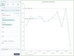
A line chart is used to show how quantitative data is changing over equal time intervals, such as months, quarters, fiscal years, and so on. The line chart is represented by a series of data points connected with straight lines. Values are represented on the y-axis, whereas categories (time intervals) are displayed on the x-axis.
The focus in such charts is the trend and not the exact time of change. Line charts can also be used to compare changes over the same period of time for more than one group. Thus, you may compare trends for multiples lines.
When to use
Use the line chart to view trends and relationships (if multiple lines are used):
- Stock value changes for a certain company over time
- Sales changes over quarters
- Sales for two different products over several years (each product is represented by a different line)
- Monthly average temperature for a city (for a given year)
Data requirements
To build this chart, define the data fields as follows:
- Dimensions – One dimension
- Measures – One or more measures
- Tooltip – (Optional) One or more measures
- Trellis – (Optional) One dimension
- Color – (Optional) One dimension
Use case
The following chart shows the progress of gross sales by quarter. Also, the red lines show the median and the maximum values of the displayed data (the corresponding options are selected on the  analytics tab).
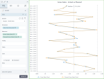
You can also use the rotated line chart: the x and y axes are swapped so that the lines go from top to bottom instead of left to right. This way, you can save some horizontal space or better display long labels.
References
For details on how to customize your visualization, see Visualization settings.
For a whole list of visualizations, see the following topics:
- Visualizations by function (find a visualization to suit your business case)
- Visualizations by type (find a visualization based on how it is organized on the interface)


Comments
0 comments