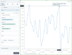
Smoothed line chart
|
|---|
Smoothed line chart |
A smoothed line chart shows how quantitative data is changing over equal time intervals, such as months, quarters, fiscal years, and so on. The lines that connect the data points are rounded to avoid jagged edges. Values are represented on the y-axis, whereas categories (time intervals) are displayed on the x-axis.
When to use
Use a smoothed line chart to view trends and relationships in a high-density dataset. If you use this chart type for normal or low-density datasets, the data may be distorted and misinterpreted.
Data requirements
To build this chart, define the required and optional data fields as follows:
- Dimensions – One dimension
- Measures – One or more measures
- Tooltip – (Optional) One or more measures
- Trellis – (Optional) One dimension
- Color – (Optional) One dimension
Use case
The following chart shows how the number of items per transaction changes over time.
References
For details on how to customize your visualization, see Visualization settings.
For a whole list of visualizations, see the following topics:
- Visualizations by function (find a visualization to suit your business case)
- Visualizations by type (find a visualization based on how it is organized on the interface)


Comments
0 comments