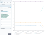
100% stacked line chart
|
|---|
100% stacked line chart |
A 100% stacked line chart compares two or more measures across one dimension (which is usually a time interval). The chart lines do not intersect because they are cumulative at each data point. Each point going upwards on the chart represents a cumulative percentage of the total values at that point. The last values should add to 100%.
Note: The data values do not need to be percentages because the sum of the data values is rendered as a percentage automatically.
When to use
Use the 100% stacked line chart to show the following aspects:
- How much percentage each value adds to a whole over a period or another category.
- How the percentage contribution of each value changes over a time period or another category.
Data requirements
To build this chart, define the required and optional data fields as follows:
- Dimension – One dimension
- Measure – Two or more measures
- Tooltip – (Optional) One or more measures
- Trellis – (Optional) One dimension
Use case
The following chart shows the trend of the percentage contributed by each of the following measures to the operating cost over a year: travel expenses, sales cost, marketing cost, and entertainment cost. The percentage contribution of each cost type by month is the emphasis of this chart, while the individual values of the cost types each month are not important.
References
For details on how to customize your visualization, see Visualization settings.
For a whole list of visualizations, see the following topics:
- Visualizations by function (find a visualization to suit your business case)
- Visualizations by type (find a visualization based on how it is organized on the interface)


Comments
0 comments