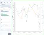
Line chart with two value axes
|
|---|
Two value axes line chart |
A line chart with two value axes compares two measures across one dimension (which is usually a time interval). Two value axes are used along with one category axis. The measures use different scales or units of measurement.
When to use
Use the line chart with two value axes to show the relationship between two different measures. For example, you can show the trends for the gross sales and for the average price of products to see if they are interconnected.
Data requirements
To build this chart, define the required and optional data fields as follows:
- Dimensions – One dimension
- Measures – Two measures
- Tooltip – (Optional) One or more measures
- Trellis – (Optional) One dimension
- Color – (Optional) One dimension
Use case
The following chart shows how the amounts indicating gross sales (the primary vertical axis) and items per transaction (the secondary vertical axis) change over time.
References
For details on how to customize your visualization, see Visualization settings.
For a whole list of visualizations, see the following topics:
- Visualizations by function (find a visualization to suit your business case)
- Visualizations by type (find a visualization based on how it is organized on the interface)


Comments
0 comments