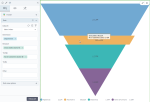
Funnel chart
|
|---|
Funnel chart |
A funnel chart is represented by a triangle pointing down, resembling a funnel shape. The funnel is divided into sections. The sections are represented by dimensions. The section height represents the quantity or value (measure). It is a single series chart representing the data as portions of 100%. Funnel charts do not use any axes.
When to use
Use a funnel chart to compare categories that are parts of a whole. The categories on a chart must be mutually exclusive and not overlapping.
Data requirements
To build this chart, define the data fields as follows:
- Dimension – One dimension
- Measure – One measure
- Tooltip – (Optional) One or more measures
- Trellis – (Optional) One dimension
Use case
The following chart shows how each department contributes to the whole 100% of gross sales.
References
For details on how to customize your visualization, see Visualization settings.
For a whole list of visualizations, see the following topics:
- Visualizations by function (find a visualization to suit your business case)
- Visualizations by type (find a visualization based on how it is organized on the interface)


Comments
0 comments