OHLC chart (stock)
|
|---|
OHLC chart (Stock) |

An OHLC (Open, High, Low, Close) chart shows the price changes over time for stocks, bonds, currencies, commodities, and other types of financial instruments. Each bar corresponds to a time unit, for example, one day, hour, or minute. This chart type is frequently used in the technical analysis of financial market trends.
The following table shows the main elements of a typical OHLC bar.
| Image | Item | Explanation |
|---|---|---|
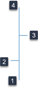 |  Low Low | The lowest price traded in the time unit represented. |
 Open Open | The price at the beginning of the time unit represented. | |
 Close Close | The price at the end of the time unit represented. | |
 High High | The highest price traded in the time unit represented. |
When to use
OHLC charts can help you detect, predict, and monitor the trends of the stock prices, assisting you in the stock buying or selling decisions. For example, you can compare the low and high prices (or the opening and closing prices) for adjacent OHLC bars. A series of three successive bars with higher high prices and higher low prices may indicate an ascending trend of the price.
Data requirements
To build this chart, define the required and optional data fields as follows:
- Close – One measure
- Open – One measure
- High – One measure
- Low – One measure
- Dimension – One dimension that contains time-related data
- Tooltip – (Optional) One or more measures
Use case
The following chart shows the daily evolution of a company's stock price over a period. The bars for which the closing price is higher than the opening price are colored in blue. The bars for which the closing price is lower than the opening price are colored in orange.

References
For details on how to customize your visualization, see Visualization settings.
For a whole list of visualizations, see the following topics:
- Visualizations by function (find a visualization to suit your business case)
- Visualizations by type (find a visualization based on how it is organized on the interface)
Comments
0 comments