Chart with two value axes
|
|---|
Bar chart with two value axes |
|
|---|
Col. chart with two value axes |
A bar (column) chart with two value axes compares two measures across one or two dimensions. The measures represent mixed types of data that cannot be compared with each other because they relate to a different scale or different units of measurement.
When to use
The bar (column) chart with two value axes can be used to show the following aspects:
- The vehicle's horsepower and MPG (miles per gallon) by vehicle type.
- The average monthly rainfall and temperature by location or month.
- The total price and the sum of units purchased by year.
If the axes use the same scale or relate to the same units of measurement, it can be a good idea to use a column and line chart instead. For details, see Bar (column) and line chart.
A bar chart displays data as horizontal bars, while a column chart displays data as vertical bars. However, the data is processed the same way.
The following table shows the main differences between the two chart types.
| Use column charts to | Use bar charts to |
|---|---|
|
|
Data requirements
To build this chart, define the data fields as follows:
- Dimension – One or two dimensions. The order of the dimensions matters. The first dimension represents the main grouping option.
- Measure – Two measures
- Tooltip – (Optional) One or more measures
- Trellis – (Optional) One dimension
- Color – (Optional) One dimension
Use case
View the following use cases for the chart with two value axes, based on the chart orientation.
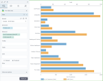
The following chart shows the number of customers (the primary horizontal axis) and the profit (the secondary horizontal axis) per product type (the vertical axis).
In this case, the bar chart is preferred to the column chart because the dimension is not related to time, and it has data with long labels. Also, in this chart type, you can notice better the big differences between the values of the measures.
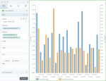
The following chart shows the gross sales (the primary vertical axis) and the number of customers (the secondary vertical axis) by month (the horizontal axis).
In this case, the column chart is preferred because time values are better understood when they are graphically represented from left to right.
References
For details on how to customize your visualization, see Visualization settings.
For a whole list of visualizations, see the following topics:
- Visualizations by function (find a visualization to suit your business case)
- Visualizations by type (find a visualization based on how it is organized on the interface)


Comments
0 comments