Interact with widgets
You can interact with the widgets in both edit and view modes. For details on the view modes, see Storyboard view modes.
You can use the following presentation tricks:
Tooltips are available for chart visualizations in both view and edit modes.
Point to a visualization element to view its tooltips. By default, tooltips show the values of the measures. In edit mode, you can include additional tooltips by selecting them in the widget settings pane, on the  data tab, in the Data section.
For some visualization types, you can narrow down the visualization view to a particular area. In this case, the visualization shows only the information for that section (for example, a bar or a set of bars in a bar chart). You can narrow down the visualization view in both view and edit modes.
Depending on the visualization type, you can use one or both zooming methods:
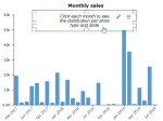
Click and drag across a region to make a custom selection of the area that you want to zoom, then release the pointer. To return to the visualization with all the data, click Show all.
Click a visualization to select it, and then scroll up by using the wheel of the mouse. If the zooming option is available, the sliding bar appears at the top or on the right of the visualization. Move the slider in the visualization (or scroll by using the wheel of the mouse), to expand or narrow the visualization view. To return to the visualization with all the data, click Show all.
You can filter data in visualizations by using the following methods:
Add a filter widget to the storyboard and connect it with the visualizations that you want to filter. For details, see Filter and Add filter widgets.
Create filtering actions for visualizations. For details, see Create actions and Filter.
You can highlight data in visualizations by using the following methods:
Add a highlighter widget to the storyboard and connect it with the visualizations that you want to highlight. For details, see Highlighter and Add highlighter widgets
Create highlighting actions for visualizations. For details, see Create actions and Highlight.
You can add text widgets on top of visualizations to guide the users when working with the storyboard.
For details on adding text widgets to a storyboard, see Add widgets.
To place widgets on top of each other, use the Bring to front and Send to back features. For details, see Order.
Actions add interactivity among widgets – you click or point to an element in a widget to trigger a visual effect in another widget, for example:
- Filter the data in another visualization widget.
- Highlight the corresponding portions of data in another visualization widget.
- Hide or show widgets on a storyboard.
- Transform one visualization type into another type.
- Open a page on the current storyboard or on another storyboard.
You can use some of the actions in view mode and other actions in both view and edit modes. For details, see About actions.
Value lines are useful in visualizations when you want to place the focus on specific values or regions of your data.
Depending on the visualization type, the following value lines can be available:
- Average – Show an average line in a visualization.
- Median – Show a median line in a visualization.
- Min – Show a line at the minimum value of the data displayed in a visualization.
- Max – Show a line at the maximum value of the data displayed in a visualization.
- Last – Show a line at the last value of the data displayed in a visualization.
- Percentile – Show a percentile line in a visualization.
- Constant – Show a line at a specified value in a visualization.
You can use value lines in the following visualization types:
- Bar and column charts (excluding box plot)
- Line charts
- Area charts (excluding heatmap area)
For details, see Visualization settings (analytics tab).
Additional options are available depending on the widget type.
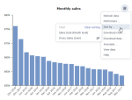
To access these options, point to  More options on the widget toolbar, and then click the appropriate option.

The most common options are listed in the following table. They are all available in both view and edit modes.
| Option | Use this option to |
|---|---|
Refresh data | Refresh the data (for example, if a dataset was updated or a website was revised). This option is not available in the Single Value widget. |
Reset filters | Remove the filters from all the visualizations to which they apply. This option is available only for the highlight and filter widgets. |
Download chart | Save a visualization to your computer in PNG or JPG format. This option is available only for some chart visualizations and only if the Trellis data item is not defined in the widget settings pane, on the |
Download data | Save the visualization data to your computer in the following formats: CSV, XLSX, or JSON. This option is available only for some chart visualizations and only if the Trellis data item is not defined in the widget settings pane, on the |
Annotate | Lock a visualization so that you can write or draw something on it. This option is available only for some chart visualizations and only if the Trellis data item is not defined in the widget settings pane, on the |
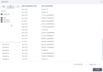
View data | Preview the visualization data in a table with the ability to filter and sort the data. The table includes the columns selected in Dimension, Measure, and Tooltip fields in the widget settings pane, on the To manage and filter columns, point to the column header, click This option is available only for some chart visualizations. |
Performers | Display the top 5 (10, 15, or 20) or bottom 5 (10, 15, or 20) performers in a column, line, bar, and radar visualization. This option is available only for some chart visualizations and only if the Trellis and/or Color data items are not defined in the widget settings pane, on the |
Sort by | Sort by columns in dimensions, measures, tooltips, trellis, and colors (in legend). Click the column in the sorting list to change the sorting order. This option is available for some chart visualizations. |






 Options
Comments
0 comments