Add filter widgets
When you have one or more visualizations on a storyboard, you can add a filter widget to filter the visualizations. Thus, the visualizations will display only the data that is relevant for your analysis and not all the data points in the visualization. For details, see Filter.
Prerequisites
- You created a storyboard, or you have access to one. For details on creating storyboards, see Add a storyboard.
- The storyboard page with the visualizations whose data you want to filter is open in the page area.
- You have at least one empty cell on the storyboard.
Procedure
On the Storyboards toolbar, click
 Enable changes, and then click
  Add widget.
The Widgets pane appears.
Click the
 visualizations tab, and then click the Tabular category.
Point to the
 Filter widget, and then drag it to an empty cell in the page area.
The widget settings pane appears on the left of the page area.
Tip: You can also add a filter by clicking the Click here to add widget link, which is available in each empty cell of the page area. From the list that appears, select the filter widget. In this list, the visualization widgets are not grouped by category.
On the
 data tab, expand the Filters section, and then click
  manage filters.
The Filters pane appears.
Click New in the upper-right corner, and then define the following settings:
 Dataset
Select the dataset used for the visualizations that you want to filter. All the visualizations must have the same dataset.
 Filters: You can filter the values to be displayed in the filter widget because all the values from the dataset are shown by default. For example, you filtered the line chart to show the dates for a specific year, and you want the filter widget for the date column to display only the dates for that year.
For more information on how to define filters, see Add filters.
 Column
Click in the field and select the dataset column that you want to use for filtering.
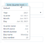
For date columns, you can change the aggregation: click the aggregation shown in parenthesis and select the aggregation you want to use for filtering. For example, you may have data points as individual dates in the visualization, but want to filter by month.
 Type
TypeYou can use the following filter types:
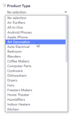
Dropdown – Select one value or all the values from the dropdown list. The drop-down list shows the records from the column that is used for filtering.
This filter type is available if you select a column that contains dimensions.
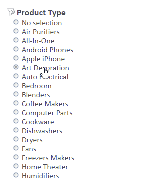
Single select – Select one option from the list. The list shows the records from the column that is used for filtering.
This filter type is available if you select a column that contains dimensions.
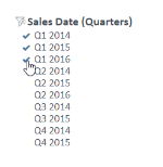
Multi select – Select several values from the list. The list shows the records from the column that is used for filtering.
This filter type is available if you select a column that contains dimensions.
Expression – Enter a mathematical expression that you want to use for filtering the data in a non-aggregated status. For example, if you use the Sales Cost column for filtering and enter the expression >100, the filtered visualization shows only the data items for which the sales cost is higher than 100.
You can use the following symbols.
Symbol Use this item to = Show only the data items whose value is equal to the specified value. For example, use "=100" to show only the data whose value is equal to 100.
> Show only the data items whose value is greater than the specified value. For example, use ">100" to show only the data whose value is greater than 100.
>= Show only the data items whose value is greater than or equal to the specified value. For example, use ">=100" to show only the data whose value is greater than or equal to 100.
< Show only the data items whose value is less than the specified value. For example, use "<100" to show only the data whose value is less than 100. <= Show only the data items whose value is less than or equal to the specified value. For example, use "<=100" to show only the data whose value is less than or equal to 100.
><
<>
Show a range of numeric values. For example, use ">100<500" to show only the data whose value is more than 100 and less than 500, or "<500>100" to show only the data whose value is less than 500 and more than 100.
>= <=
<= >=
Show a range of numeric values. For example, use ">=100<=500" to show only the data whose value is greater than or equal to 100 and less than or equal to 500, or "<=500>=100" to show only the data whose value is less than or equal to 500 and greater than or equal to 100. This filter type is available if you select a column that contains measures.
 Target widget
Click in the box under Type, and then, in the list, select the visualization that you want to filter. When you point to a visualization in the list, that specific visualization is framed in red on the storyboard. You can select one or more visualizations to filter at the same time.
The Target widget list contains only the visualizations on the storyboard page that have the same dataset that you selected in the Dataset field.
 Name
NameIn the Name field, enter a name for the filter.
 Parameter
(Optional) In the Parameter field, enter a query parameter to filter embedded and published storyboards.
When using query parameters, consider the following:
Values for the filter parameter should be the same as listed in the Filter widget.
If using multiple values, separate them by a comma. For example, “&city=London,New%20York”.
Each parameter starts with the ‘&’ sign. For example, &store=Mall&dep=Electronics.
If the values have spaces or other special symbols, remember to convert them appropriately for the URL encoding. For example, “&city=New%20York”, where space is specified as %20.
If you use an expression filter, add the ‘=’ sign followed by the encoded expression. For example, &profit=%3C1000 (Profit < 1000).
Filtering applies to all widgets in a storyboard where filters use the same parameter name.
 Example – Filtering a widget with parameters
Let’s say you have an area chart with two filters, where “store” and “dep” are query parameters.
If you add &store=Mall,Standalone&dep=Electronics to the published storyboard URL, the visualization shows data only for the Mall and Standalone store types with the Electronics department.
The corresponding filters widgets are updated. You will see the values as selected if the widgets are visible in the storyboard and not hidden as a layer behind a chart.
Tip: To quickly add a filter to the storyboard, click the arrow button next to the New button in the upper-right corner, and then click the needed filter type on the shortcut menu. The Type and Name fields are filled in automatically with the filter type that you selected and a default name, respectively.
Click Apply, and then close the widget settings pane.
The filter is displayed on the storyboard, and you can use it to filter the visualizations.
To clear the selections, click
 clear selection in front of the filter name.
Click
 Save on the Storyboards toolbar.
Tip: To improve the design of the storyboard, use the Snap to cell feature for all the widgets on the page. To place widgets on top of each other, use the Bring to front and Send to back features. For details, see Arrange widgets on a storyboard.


Comments
0 comments