Scatterplot heatmap chart
|
|---|
Scatterplot heatmap chart |
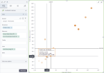
A scatterplot heatmap chart shows a potential relationship between three numerical values within a single dataset. The data is displayed as a collection of points (markers). Each point has three values that are measures for the selected dimension. The first value determines the position on the horizontal axis, the second value determines the position on the vertical axis, and the third value determines the color of the point. In other words, a scatterplot heatmap chart extends a scatter plot chart by adding a third variable to each point. For details, see Scatterplot chart.
For example, if your scatterplot chart shows the relationship between the age of a house (the first variable) and its proximity to the downtown (the second variable), and you want to add the price of the house (the third variable), then a scatterplot heatmap chart will be a good choice. The price of the house determines the color of the points, the age of the house is on the horizontal axis and the proximity to the downtown is on the vertical axis.
In addition, a scatterplot heatmap has much in common with a bubble chart. The main distinction is that the third value is rendered by the point's (bubble's) size in a bubble chart. For details, see Bubble chart.
When to use
A scatterplot heatmap chart is used to show relationships between three sets of numerical data. The examples can include the following numerical data:
- Life expectancy, median family income, and current fast food use
- Precipitation, elevation, and temperature
- Profit, cost, and the probability of success
- Average monthly salary, gross domestic product (GDP), and population size
The other examples of the third additional value can relate to such aspects as frequency, density, altitude, and so on.
A good rule would be to use a sequential color palette for the scatterplot heatmap chart. In that case, it is much easier to interpret the value that is rendered by color: the darker the point, the higher the value.
Note: For this chart type, you need to set a rule for calculating the color range: by rank or by value. For details, see the Color range in the Palette and style section in Visualization settings (appearance tab).
Data requirements
To build this chart, define the data fields as follows:
- Dimension – One or more dimensions
- Measures – Two measures
- Color – One measure
Tooltip – (Optional) One or more measures
Use case
The following chart shows the correlation between gross sales and the number of customers, per product line. The color of the marker represents the average price. The sequential palette was used for this chart type (heatmap). For details, see Color palettes.
References
For details on how to customize your visualization, see Visualization settings.
For a whole list of visualizations, see the following topics:
- Visualizations by function (find a visualization to suit your business case)
- Visualizations by type (find a visualization based on how it is organized on the interface)


Comments
0 comments